


Guy Diehl gained the label photorealist in the 1970s, when he was making swimming pool and beach themed paintings and watercolors. He would toil over the details of concrete surface texture and each grain of sand in these meticulously complete artworks. At the time, he was clearly under the tutelage of his graduate school mentors Richard McLean and Robert Bechtle, both noted photorealist painters, who came to prominence in that era. But it was several encounters with Gordon Cook’s paintings in the early ‘80s (at the Charles Campbell Gallery, Oakland Museum, and at Modesto Lanzone’s Ghirardelli Square restaurant), and exposure to Susan Hauptman’s charcoal still life drawings (introduced to him via gallerist Jeremy Stone), that made Diehl want to turn exclusively toward still life. This subject matter shift coincided with a desire to exercise more restraint in his painting technique. Cook’s work in particular caused Diehl to reflect upon the limits of detail, concluding that less might in fact be more. By this point, Diehl was a full-time artist with a part-time teaching post. He had exhausted the creative challenges posed by the Swimming Pool series and had already gradually been moving in the direction of still life, as he eliminated the figure from those compositions altogether.
A throughline from the early poolside scenes that continues in Diehl’s still life work today are the art-about-art references. Recognizable reproduced icons like Pop images by Roy Lichtenstein and Piet Mondrian’s De Stijl abstractions, which once appeared on towels and other bathing articles, now feature on Diehl’s still life stage. No doubt, his college art instructor Mel Ramos had influenced Diehl in this respect. While Diehl was a student at Cal State Hayward, he’d seen Ramos repurposed the famous Jean-Auguste-Dominique Ingres paintings of the 19th century, which feature reclining nudes. Diehl’s girlfriend at the time had even been a model for some of those paintings, so it is not surprising that the referencing to other works of art, particularly those embedded in the canon of Western art and Diehl’s personal history, would eventually find their way into his own paintings.
What Diehl embarked upon in 1985, remains his focus today, as he has produced more than 400 paintings in his Still Life series, featuring an assortment of bottles, books, and artist postcards in various center canvas groupings. The full turn to still life has allowed Diehl to focus on tonality, light, and the transitions between painting from one color field to another; as well as the challenge of handling the intersection of hard edges that invariable occur given his tight clustering of still life objects.
Despite his own belief about his technique, Diehl is often viewed as if in pursuit of hyperrealism perfection. Diehl would say yes, perfection to achieve balance, but not to display academic drawing abilities. He isn’t painting every hair or groove on a porous vegetable surface. Rather, he’s only rendering what he believes he needs to, as in the words of fellow painter F. Scott Hess, “I only paint enough detail to be convincing.” The restraint exercised allows for other possibilities in the painting, particularly elucidation of how a smooth area communicates with other such elements, and an allowance for color and angles to project calmness and balance, even beauty.
A fundamental desire to orchestrate the viewing experience motivates Diehl. He hopes that the viewer will see truth that transcends technique. Diehl presents truth modified by choices that elevate juxtapositions to keep the eye from getting trapped in one place and that encourage a more sustained viewing event. Less detail can let the complexity of the built-up composition of objects speak for itself. He doesn’t paint every wrinkle on a paper surface, for instance, because achieving that level of detail would turn the exercise into one strictly about his skill, which the Swimming Pool series had already satisfied.
While Diehl has arrived at a different boundary of realism than Gordon Cook and Giorgio Morandi, another painter who inspires him today, Diehl still references those masters of “less” to explain where he fits in the painting pantheon and to assert his proximity to them. The resulting calmness and tone has a minimalist quality that most adherents of realism don’t achieve. There isn’t anything clever, and there aren’t any tricks of the eye as you see in trompe-l'œil, for instance. Instead, Diehl paints sharp focus in places where it’s necessary, but adds just enough detail in others to make it convincing. This gives the viewer both honesty and assistance in directing the eye as it traverses the composition.
The exhibition at Dolby Chadwick features 14 paintings plus a single drawing done in the last 2 years. There are references to the Covid-19 pandemic and several allusions to art history, usually presented via the placement of artist postcards within the still life compositions. His assortment of unique objects are present, as one would expect given their signature relationship to his work, and the compositions tend toward a strong central compositional object staging. 
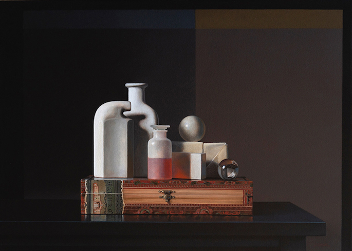
Still Life with Group f.64
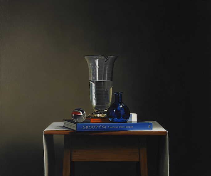
To understand Diehl’s work, it’s essential to recognize the role object placement plays in his work, both in the construction of the composition and in suggesting meaning. One work from the show is a painting about a famous American photography group, but it didn’t begin as such. The initial choice of the central glass object compelled the trajectory of the final composition and its overall theme.
Diehl first selected a beaker to be the focal point in Still Life with Group f.64 (acrylic on canvas, 30 x 36 inches, 2020). The painting features a large coffee table blue covered book, its spine embossed “GROUP f.64 American Photography.” Central to the staging is a cylindrical glass vessel, with a pouring lip and capacity markings on its side, which had once belonged to his father who used it while in high school to hold the developer fluid necessary in the silver gelatin photo process.
The object’s true nature ultimately pushed the painting toward American photography. Imogen Cunningham (whose name is featured on the spine of another book rendered in the painting), Ansel Adams, and Edward Weston, were among the photographers who formed the group known as f.64, which got its name from the small aperture in a large format camera. The principles this group claimed to adhere to are the very ones that characterize much of Diehl’s work: sharp focus, lengthy exposures, meticulously framed images, and importantly, a lack of movement in the subject. As a result, the group had a preference for found objects and natural shapes, often details of a larger form present in the natural landscape. Furthermore, the Group f.64 photographers and Diehl both care deeply about depth of field, making the image sharp and evenly focused throughout from foreground to background.
The way light is rendered because of object placement is also evident in this painting, particularly in the distinct and subtle gradations of color on either side of the central beaker. His color transitions are what marks his unparalleled style, driven by careful attention to how light sources strike a staged scene.
Where the f.64 photographs found their inspiration in nature, Diehl makes a commentary about his natural surroundings, an urban 21st century modus vivendi, of life amidst objects. Diehl taps into the idea that objects have significant value in our lives. The placement of objects and a person’s relationship to them is essentially the essence of Art. Objects suggest narrative; their presence animates or calms the spaces we live in. Books suggest a life of contemplation in the same way that the visual experience of fading color and sharp angles direct us to think in a particular way.
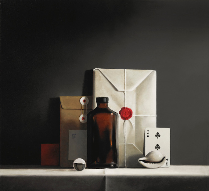
Many of the objects found in Diehl’s paintings have very specific meanings for the artist. A circular crystal marble, for instance, appears in eight of the paintings in the exhibition, including the Group f.64 painting. The marble represents looking into the future, no doubt because of its crystal ball shape, but also because it works like a lens. It encapsulates depth, and its reflexive quality turns images around, projecting possibilities. Further, because Diehl paints that complexity in the circular space, the viewer’s eye can’t help but be enticed by it, thus in some cases, distracting the viewer from heavier areas of the composition in which the eye could easily become trapped. He renders this same effect at the foot of the crystal vessel. By contrast, the plain white cue ball which appears in many other paintings represents the present. It lacks writing and any numerical reference, thus lowering its complexity and reflective qualities.
Aside from avoiding objects that he believes are nostalgic, in the Pop Art sense that a coke bottle or vintage toaster might result in recognizable meaning and hackneyed themes, Diehl is interested in objects that are less known, yet just as evocative of mood. The classic shapes: cube, cone, cylinder, sphere, and rectangle are all represented in the various glass vases, bottles, envelopes, seashells, cigar boxes, and inkwells he chooses. Calipers (the measuring device) are also favorite objects, as are his own collection of crook neck bottles, manufactured by the Odol antiseptic brand in Europe, which he first saw in a Stuart Davis painting.
Diehl goes to lengths to eliminate popular brand labels so that objects cease to hold too many nostalgic associations. He’ll paint a balsamic vinegar bottle white and strip the label from a Hendrick’s gin bottle, with the result being something mundane yet mysterious. It evokes familiarity, but the viewer isn't forced to accept a particular meaning.
This familiar anonymity makes the viewer want more from it. It acts as a kind of pattern recognition, which doesn’t overwhelm as an iconic reference might. Instinctively, when you stand in front of a Diehl painting, your own mind conjures up its own associations, as if flipping the pages of a scrapbook of memories. We may not share the exact narrative, but we seem to have relationships with these objects that make them familiar and closer to us.
Diehl tends to build his still lifes by clustering them into a center form, in effect, creating a new object. By doing so he is indebted to Georgio Morandi who staged his still lifes in the center of the composition and also the cubist painters whose canvases often used angles and painting transitions to build up a cityscape or abstracted figure. Curiously, Diehl cites displays he sees when he visits local stores like Macy’s or Safeway, as subject matter influences. He pays close attention to the spacing of objects in such locations, as he contemplates possible borrowings for his next painting. The compression of objects is part of Diehl’s pursuit of equilibrium and quest for balance. No doubt, this is something he learned from Morandi, who often makes several still life objects appear to be as a unified single whole.
Balance and equilibrium are paramount in Diehl’s work, much as with David Ligare’s classical Greek and Roman themed paintings. Both see balance, elegance, and form as important elements to be carefully supported by light sources. Both use harmony to unite the colors of the composition, through contrast or object placement to create a balanced visual medium. Both achieve a contemplative quality in their work.
While object placement makes a Diehl painting immediately recognizable, it is the presence of light that may be what the paintings are actually about. Diehl grapples with how to render a motionless array of objects. But his core challenge is how to do so as the light changes throughout the day. As a result, he’s learned to work with photography as a means to record the light values and which he can later reference.
Even before he takes the source photograph, Diehl is acutely aware that he will spend weeks painting his canvas, so he stages the still life and then waits for the exact light he wants to capture. This is how the painting begins. The artist keeps an eye on the composition as different types of light hit the objects and casts shadows throughout the day. Since he’s working with various objects he’ll experiment with various placements, until he has it just right. I imagine it’s like a runner stretching their limbs and adjusting the way they place their feet in the starting blocks before a race even begins. It’s only when he’s ready that the photograph he will use throughout the process is actually taken.
Not surprisingly, daylight is a favorite time for Diehl, particularly when low diagonal light is present. He utilizes baffles to artificially narrow the beam of light source, as it absorbs and traps excess light, and to experiment with exposures. Diehl also refers to Vermeer’s window light, which he is especially fond of, meaning the light we often see in Johannes Vermeer’s 17th century paintings, which always comes into the canvas from the left. The light, in part, directs how the cluster of objects is assembled. In many respects, Diehl’s attention to object placement is primarily for the sake of making a painting about light itself.
Conversation with Magritte & Delaunay / Conversation with Egon Schiele
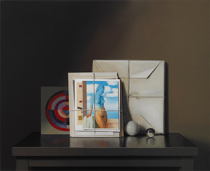
Examples of Diehl’s restraint help to understand the effect he wishes to produce by holding back. In Conversation with Magritte & Delaunay (acrylic on canvas, 26 x 32 inches, 2019) for instance, a butcher-paper wrapped parcel shows a crease in the upper right. Not rendered are the other creases in the original, which Diehl chose to ignore. By deciding to only paint the one pleat, he conjures a truth, but chooses to imagine smooth areas to play off of the spatial area to the left, present around the Magritte postcard, particularly in color tone. This possibility would have been lost had he adhered too strictly to the strictures of realism.
Diehl engages in selective detail. He idealizes parts of the composition to work in juxtaposition with other elements in his still lifes. He doesn’t seek imitation per se, but rather helps parts of the canvas speak to one another. Likewise, for the cigar box in Conversation with Egon Schiele (acrylic on canvas, 24 x 30 inches, 2019), (a painting not included in this exhibition but viewable on the gallery website) Diehl has held back from painting the detail of the paper labels, not because he can’t take realism further and paint all of the faux filigree there, but because he recognizes the limits of pure imitation, what the Greeks called mimesis, a term which recognizes that a copy can both serve as an ideal yet fail to achieve truth. 
Diehl is a realist with a minimalist aesthetic. He’ll execute detail when he feels it’s necessary, but he isn’t trying to imitate photography. He isn’t into duplicating wood grain perfectly, for instance. While he uses photographs taken to capture a particular moment of lighting, the photo serves only as a source as he engages in the push and pull of how much detail to include as he resolves the visual problems he encounters. He wants to achieve fidelity, but he won’t hesitate to adjust objects. For instance, the actual table top the objects are sitting on, have been cut off on either side, in an attempt to confine the objects. He’ll also use his own titles, with books he renders and sometimes affix a number to an object to create mystery. 
Still Life with Take-Out Food (graphite)
There is a single graphite powder drawing in the exhibition that is striking in its lack of contrast. The reductive drawing process is made possible because of the characteristics of the paper used, which in this case was handmade by Donald Farnsworth at Magnolia Editions in Oakland, California. Farnsworth made this paper in a laborious process, as he continues to perfect his pursuit of 16th century Renaissance style paper, an exploration he has been on for several years. This particular sheet of paper was an outtake of Farnsworth’s efforts. It entailed the composting of organic linen rags for three years (mixed with hemp), during which time earthworms were employed to help decompose the fabric to the point where Farnsworth could make pulp out of it, eventually using a hydraulic press to eliminate moisture, leaving a durable long-fibered linen paper.
For this drawing, Still Life with Take-Out Food (graphite on 16th Renaissance-style linen-hemp paper, 11 x 12 inches, 2018), Diehl first smeared graphite into the paper then started a process of erasure, slowly returning areas to their original white color. The paper’s surprisingly robust character is what makes it able to endure the abusive elimination process. Erasure friction doesn’t cause the surface to fray or tear as Diehl essentially drew upon it with an eraser. Diehl also reengaged the linen with graphite pencil, culminating in the finished drawing in the exhibition, which portrays a take-out themed composition, reminiscent of the pointillism of Georges Seurat.
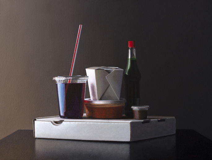
Take-Out Only #3
Covid-19 is also responsible for three “take-out only” paintings in the exhibition. Diehl gathered plain white containers, including pizza boxes and the stiff folded paper stock boxes commonly used by Chinese restaurants, from various recycling bins near his live/work home in Marin County, California. In many respects, they can be seen as conversations with Gordon Cook, particularly Take-Out Only #3 (acrylic on canvas, 12 x 15 inches, 2020), which homogenizes the contrast and color fields, and are noticeably cooler in tone.
In each of the paintings, Diehl placed a red paint element unifying the paintings in both subject matter and composition. Why red? Diehl says it was suggested to him, but the color can also be viewed as an ominous reminder of the deadly pandemic that gave rise to magnified take-out culture routine Americans have grown accustomed to, one indicative of how the danger has yet to subside. The paintings capture how everything seems disposable and our ideas blurred during this moment in history.
Four Beets
His first college art instructor, Edward Higgins, shaped Diehl’s early art inquiries when he first attended Diablo Valley Community College in Pleasant Hill in 1968-71, in ways that still resonate today. Before he would encourage Diehl to work with Mel Ramos, who would in turn send him toward Bechtle and McLean, Higgins gave him his first assignment in his Painting 101 class. Diehl was instructed to view a Wayne Thiebaud exhibition at the E. B. Crocker Art Gallery (now the Crocker Art Museum, in Sacramento) and make a painting influenced by what he saw.
Thiebaud, himself an adherent of Morandi, who in the 70s would be part of a painting circle with Gordon Cook (among others), had only recently made it onto the art scene via the Allan Stone Gallery, where he had a solo show in New York City in 1963. Diehl’s visit would augur a lifelong inquiry into the question of restraint; a question critical to Thiebaud, Cook, and Morandi’s own work.
Diehl satisfied Higgins’s assignment by painting Four Beets (acrylic on canvas, 14 x 16 inches, 1969/70) with leaves. It’s a remarkably successful painting for his level of development, utilizing Thiebaud’s blue shadows and horizontal dividing plane.
Although not in the current show, the painting is illustrative of his influences. While he would never share the thickness of Thiebaud or Morandi’s texture, Diehl would nevertheless be influenced by them. Where Morandi lowers contrast, celebrating the obfuscation of subtle gradations of color, Diehl focuses on light and shadow to render his composition. Like Cook who works within grey tonal qualities, Diehl is a master of transitions, using edges and the gradation of color to reveal shapes and the curvature of objects. Morandi, on the other hand, was first and foremost about simplicity, which he achieved with expressionist textured brush strokes. If Diehl is indebted to him, it is in simplicity of composition and about the tonal variances they achieve. Brushwork is not what makes these painters kindred.
Conversation with Raphaelle Peale
Diehl had known his partner Kelly Beede since their teenage years. During the last month of her life, Diehl painted a still life Conversation with Raphaelle Peale, which he believed would require less focus to complete. He purposefully wanted to avoid the need to concentrate in the way a complex painting demands, given the emotional feelings he was experiencing throughout her illness. Diehl says he resorted to a more academic composition.
He clipped a branch with lemons on it from a wild tree in the backyard of Magnolia Editions in Oakland, where he goes weekly to work with Farnsworth on etchings and other prints. The leaves were intriguing because they showed ruggedness, speckled with various holes. The tree itself is a survivor, managing to thrive in a light industrial location facing environmental hardships.
A glass marble was added as a final element to the painting to unified it with the others in the exhibition, which all include manufactured and processed objects. Eight of the 14 paintings share that object placement. The title is an homage to early 19th century Raphaelle Peale, considered the first professional American painter of still-life.
Despite his hope that the painting would be easy, it became difficult to resolve. He needed to paint a vignette emanating from the central branch toward the background, which was flat at the time, and that posed a challenge. He also had to contend with the brightness and placement of the cut branch stem, which emanated vivid white.
Diehl acknowledges that many of his thoughts about the painting have resulted after the fact; viewing the still usable branch, cut off from its source as an unconscious metaphor for Kelly’s death. The branch wasn’t an inanimate object; it straddled both the quality of being alive and not alive at the same time. An awareness of mortality and the preciousness of life now permeates the painting. It seems to capture the cycle of life and natural process of growth and death.
Art about art
Art-about-art is an encompassing term that is often associated with Diehl because of the placement of artist postcards in his work. In Diehl’s art, historical references are not parodies of masters, such as Cindy Sherman’s recasting of the Baroque painter Michelangelo Merisi da Caravaggio’s “Young Sick Bacchus” seems to be. Nor is it Pop Art, as Mel Ramos explored with Ingres’ reclining nudes. It is closer to homage as assemblage artist Joseph Cornell favored as he collaged well-known imagery by Johannes Vermeer and Leonardo da Vinci.
Diehl goes beyond paying honor to the masters. He uses artist postcards with reproduced imagery to expand narrative and introduces art historical references that he believes are needed. He isn’t critiquing these masters nor simply appropriating their imagery. Rather, he’s referencing them to complete his own composition. This is why many of the titles are “Conversation with [insert the postcard artist’s name].” These postcards cease to be strictly reproductions of other paintings and become a unifying element in the still life itself.
In some manner, Diehl is hoping to lure the viewer into his painting, by triggering thoughts through imagery. Postcards themselves act as communicative missives. We write on them and mail them to friends. The postcards Diehl paints don’t appear to have been written on or posted in the mail; they’re too pristine for that. Yet they still contain that functionality and possibility.
It’s worth considering that many Americans only come into contact with masterworks of art history in books or precisely these types of postcards. How ironic that we go to see an exhibition at a museum in order to peer at the postcards we may have affixed to our own refrigerators. For Diehl, while he references other recognizable artworks by masters, he does so because those images have entered the popular domain as objects. The commentary being made isn’t about these artists as much as it is about popular reproductions and how we look at art and how it becomes part of a popular consciousness. There is homage in these, but Diehl is not praying to these painting images, rather he is examining the meaning and complexity of viewing art.
Art-about-art is not a new concept, as artists have been remixing ideas from other artists throughout history. Referencing other artists’ images is used to comment on or link to the objects within the painting. Ultimately the postcards that Diehl is reproducing can be said to be ubiquitous, like glass jars and books and other still life objects, hence their universal appeal.
Conclusion
Whether viewers will recognize Diehl’s method of restraint and examination of balance is unclear given that some of that understanding might be derived by access to source photography. Regardless, what most art patrons will surely experience is a deep sense of calm in viewing these paintings. It is evident that the painter’s skill is in service to the principles of poise and equilibrium, while still satisfying the rigors of creative composition.
There is a reverence and humility that attends Guy Diehl’s work. Realism only approximates the scenes he sets. —Matt Gonzalez
Acknowledgments
Conversations between artist Guy Diehl and Matt Gonzalez occurred on November 5, 15, and 21, 2020, in San Francisco and Marin County. The show is on view at Dolby Chadwick SF through December 5, 2020.


