


Poul Gernes was an extraordinary Danish artist, and when I stumbled upon an exhibition of his work at the stunning Louisiana Museum outside of Copenhagen, my feet skidded to a halt. First it was the ’70s-era book covers arrayed with simply striking flowers that floored me, then an installation of giant 3D shapes to wander through, followed by countless other joyful and welcoming works.
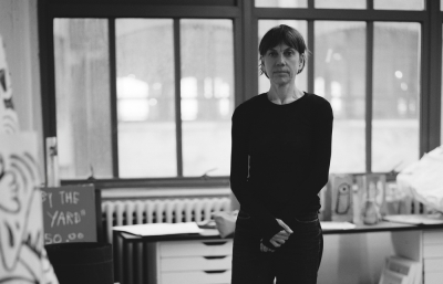
On the twentieth anniversary of his departure from Earth, the exhibit honored his enormous impact. Curator Anders Kolb offers insight into the life of this memorable artist, who, incidentally, had a controversial history with the museum.
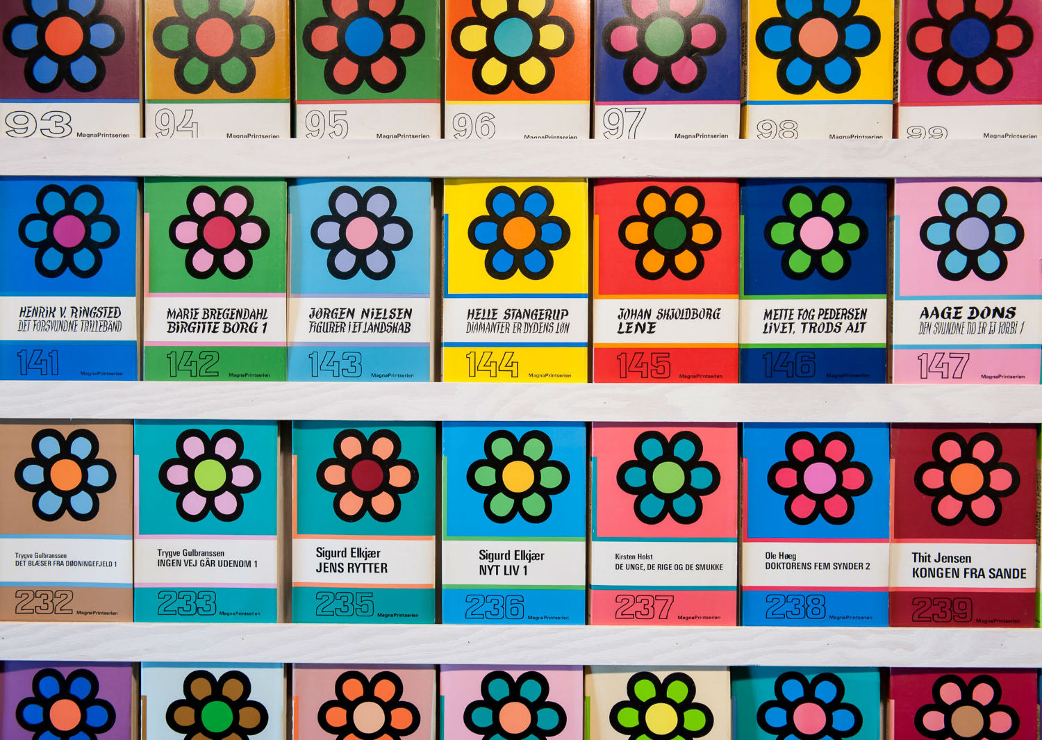
Kristin Farr: Tell me about Poul’s cover designs for books intended for the visually impaired.
Anders Kold: The work for the book covers relates to a period in time when ornamentation became a big subject for Gernes from the 1970s onwards—in books, as well as in large commissions like hospitals, schools, and other public spaces.
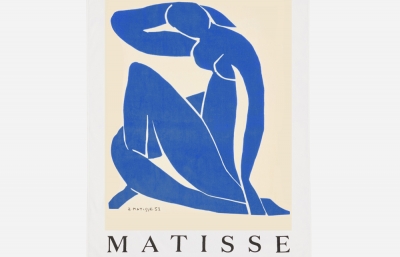
The design was simple, a flower, that he would vary in color combinations for each new book. In all, 500 covers were produced. The series comprised all sorts of literary titles and was produced for the sight-impaired, not for the blind. The types were just larger than normal. The choice of a flower was typical of the period—flower power and such notions—yet also resolutely democratic. They are found in everyone's lives at some stage, for both adults and children. Floral patterns are important to Modernism at large—Matisse, for instance. Yet the design of a flower also held certain qualities particularly kindred to the mindset of the avant-garde of the 1960s in that it has a certain generic modular repetition and multiplication. Gernes was all for designs that were made up from simple gesture or forms: circles in this case. And they can be endlessly played out as the motif has no resonance to the outer world. Therefore, no natural color scheme restricted his endless variations. After his death, his wife Aase carried on the scheme for some years.
Did he take on other design work?
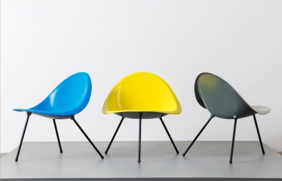
Outside of his massive public commissions, which nearly all have decorative elements and design, there was one job that he did for the Danish manufacturer of chairs, Fritz Hansen. For them, Gernes did a color scheme for the famous Arne Jacobsen Series no. 7 chair.
It seems he was very intrigued by forms and letters in general.
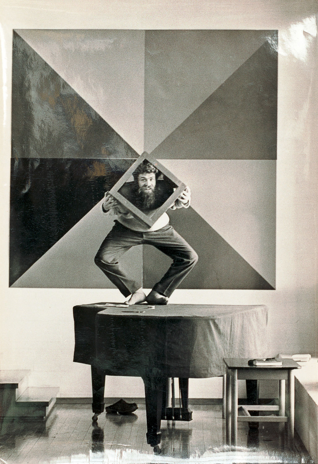
Yes, and he was trained initially as an engraver, which, of course, provided him with skills in that direction. The Form Alphabet relies on a set of well-known shapes and forms made in wood for children—basic, like Bauhaus, and indeed, in that tradition. Architectural, if you will. He would have sensed the potential in something readily at hand, treasured it for not being high art, but for being generic, basic design handed down over generations. Wanting to align the work of the avant-garde with an open-ended and more democratic sensibility, he must also have taken interest in the point of view of producing something that was less individual and hence less relying on his “mastery.” The shapes were readily available and he only had to scale them and produce them. Unlike the American Minimalist and West Coast fetish-finish artists, Gernes always left completely visible to the eye of the viewer that the forms were clamped together with little sophistication and then painted in bold colors. It all shows; there’s no industrial lacquering.
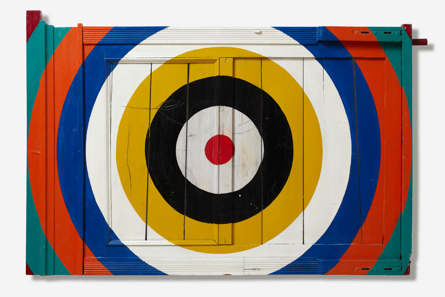
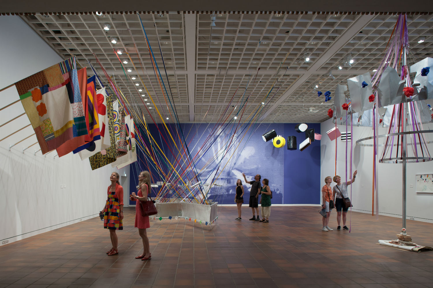
The Alphabet was made in 1968 and was, in effect, a three-dimensional materialization of the many serial works with stripes, targets and such that he had been engaged with from 1965-68. The works were increasingly calling for real space, not imaginary space.
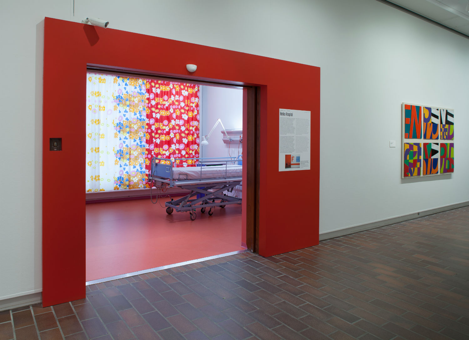
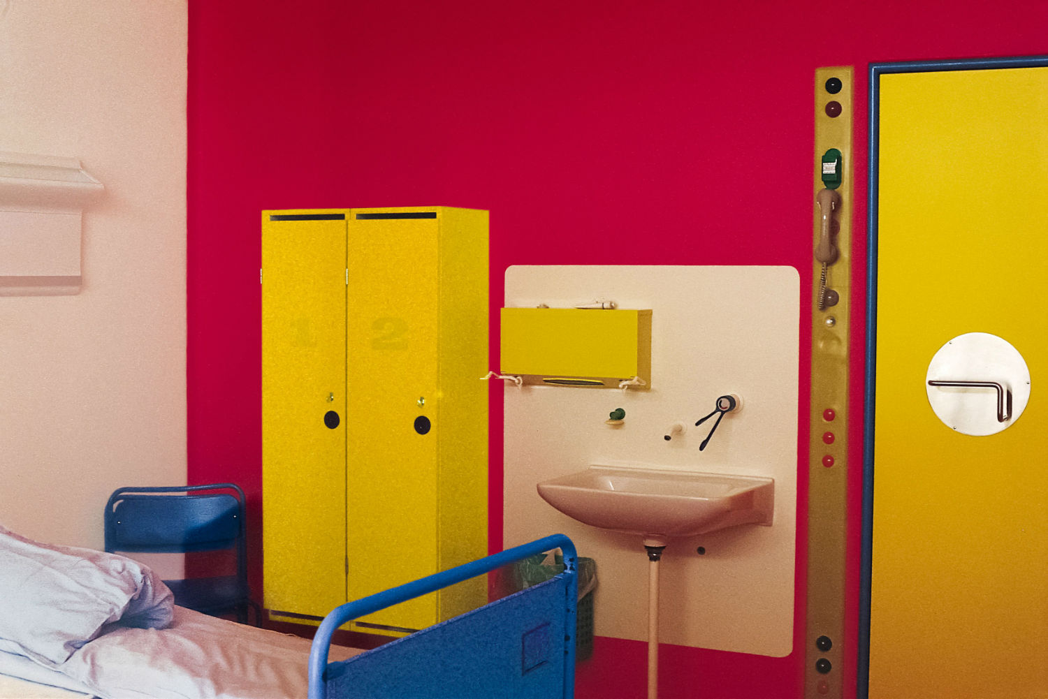
In that same year, he also received a grant to decorate the hospital in Herlev, which remains the largest artwork in our country. This lasted until 1978. The hospital room in the exhibition is the only remaining exact design made back then. It's a hospital, and hence, alterations have been made, some things are no longer functional or present. The Museum of Art in Public Space (KØS) in Køge, south of Copenhagen, rescued the room for eternity and this presentation at Louisiana. This is its institutional debut.
The Louisiana Museum has a long and dramatic history with Gernes, marked by a 1970 group exhibition when the artists walked out in protest. It’s a fascinating and controversial story involving Bjørn Nørgaard’s slaughtered horse artwork, and Gernes’s own spectacle installations of a bowling alley, boat shop and Citroën cars. Was the relationship between Gernes and the museum eventually repaired?
I wrote an article about the Tabernakel exhibition in the catalogue for the Gernes exhibit. It’s a long story. The relationship was never restored, but it has not prevented us from expanding the collection of Gernes works significantly over the last ten years.
How did it feel to finally realize Poul’s originally rejected proposal for a giant outdoor wooden pyramid, and how did you make it happen?
The Pyramid was, of course, exciting to make. Together with artist Anders Krüger from Sweden (who knew Gernes and worked for him on his last marble works), I estimated the construction and scaling of the work that was never produced. It was important, on the one hand, to manifest the intentions of the artist, not just the design, and on the other hand, not to make “the real thing.” It remains a scale model for exhibition use, even for its sizeable dimensions: 20 x 30 x 30 feet.
How did you narrow your selections for the exhibition since Gernes was so prolific?
I was facing a fundamental problem in relation to the more than 200 public commissions he had created up until his death in 1996. How to represent them? I decided, as you saw yourself, to leave them all out except the one hospital room, and I did this because exhibitions that are presented like books are very often really boring. If the ideal way is to make a book, don't make a show then; make a book. A book was actually just released on the decorative commissions Gernes did from 1970 onwards.

What did you most want people to know about the artist as you put the show together?
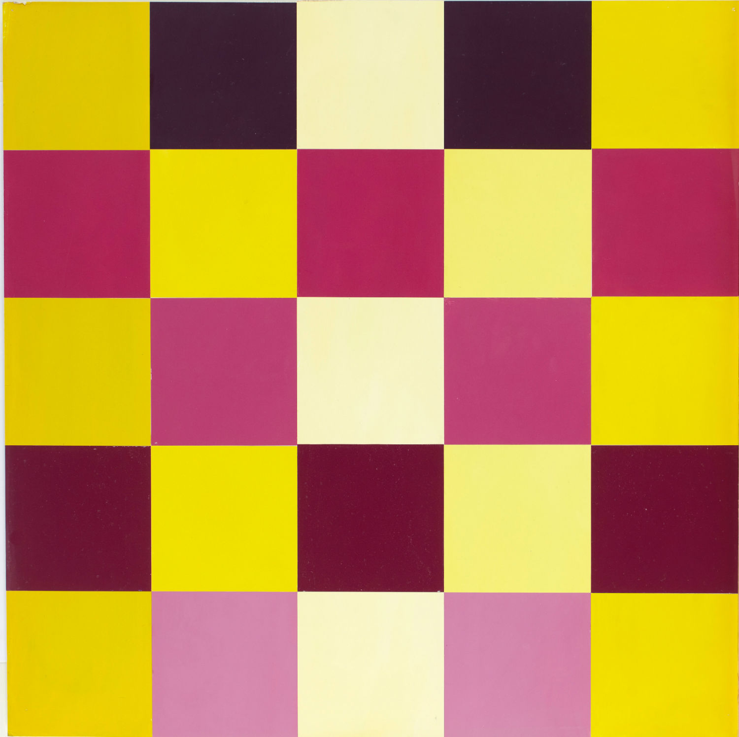
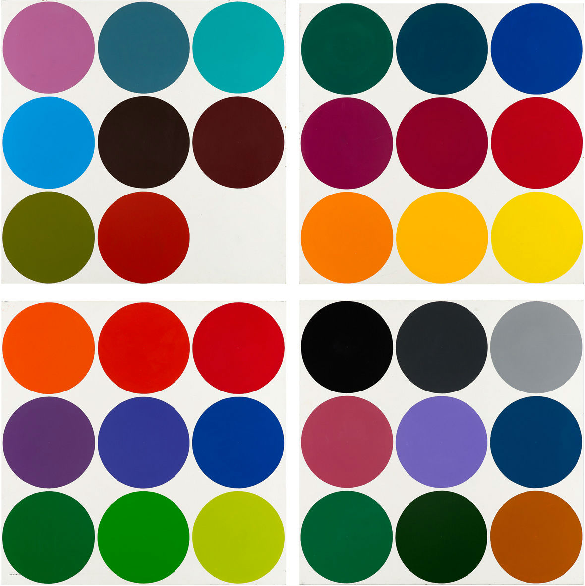
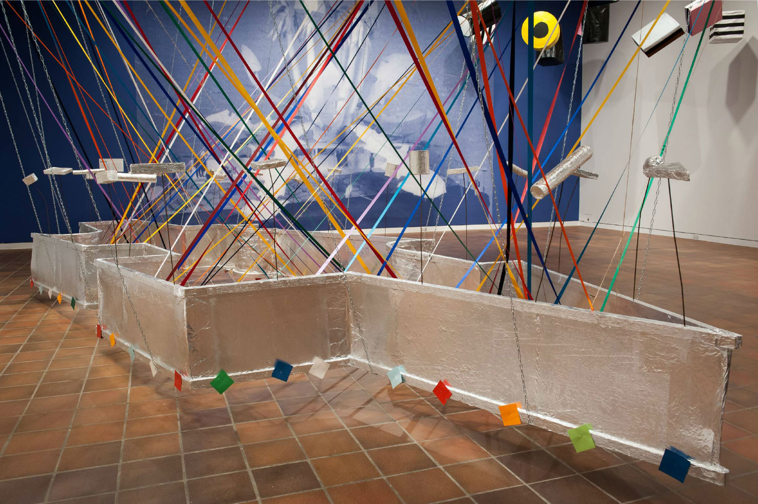
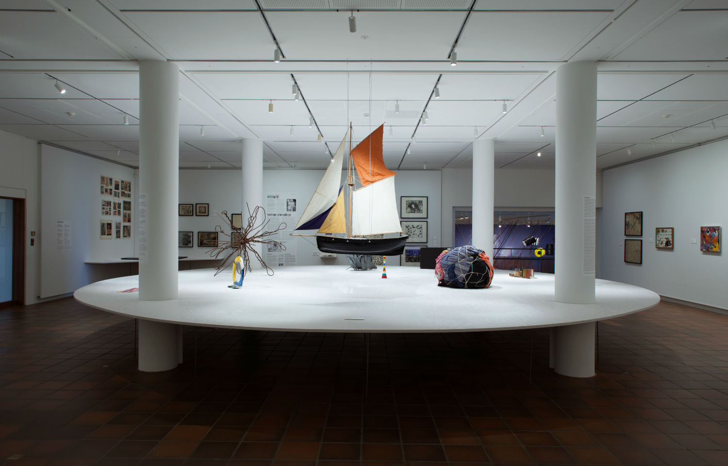
I wanted our guests to feel that Poul Gernes has a lot more than target paintings and stripes in him—that his oeuvre is so diverse, so multi-disciplinary, and so insistently good. I don't have a favorite part, and I think this is probably due to the fact that he made so many good works. The exhibition is built counter to any chronological order. It unfolds like an anthology and has three entrances, none of which carries any priority over the other two. As a viewer, you must try to make sense of certain generic strands of his designs. His approach to materiality and his concepts for what art can be run through everything—large installations looking like public monuments, yet without any iconography linked to kings and church or state, for that matter. Flags with ice-cream cones and flowers applied, simplistic repetitions of bold colors in schemes that are always playful, yet never pointed toward the artist as a genius.
Crude and simple actions of the early ’60s denigrated the “nobility” of artistic material and introduced a novel sense of the real world—works like Bath, which was produced for an exhibition in 1969 and consisted of only readymade materials. Unlike Duchamp, the Gernes work was functional—a number of showers, towels and a sauna installed for everyone to strip and wash, shower and finally dry off. All these approaches were simple in a way, not difficult schemes related to higher spheres, and introduced a farewell to the conventional condition between artwork and viewer. Gernes, I believe, saw himself as a twentieth-century incarnation of the bottegas or workshops of the Middle Ages. His work has an effect on us and it all relates to the real world, not one of history or literary sources. He was anti-intellectual in a way, certainly anti-academic.
Poul Gernes: I Cannot Do It Alone—Want to Join In? was on view through October, 2016 at The Louisiana Museum of Modern Art in Humlebæk, Denmark.
----
Originally published in the December 2016 issue of Juxtapoz Magazine, on newsstands worldwide and in our web store.