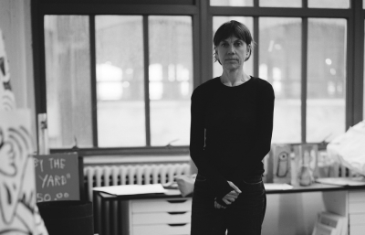

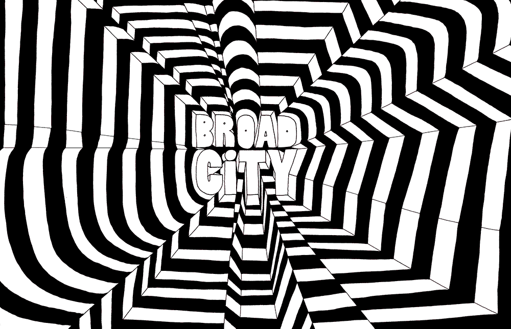
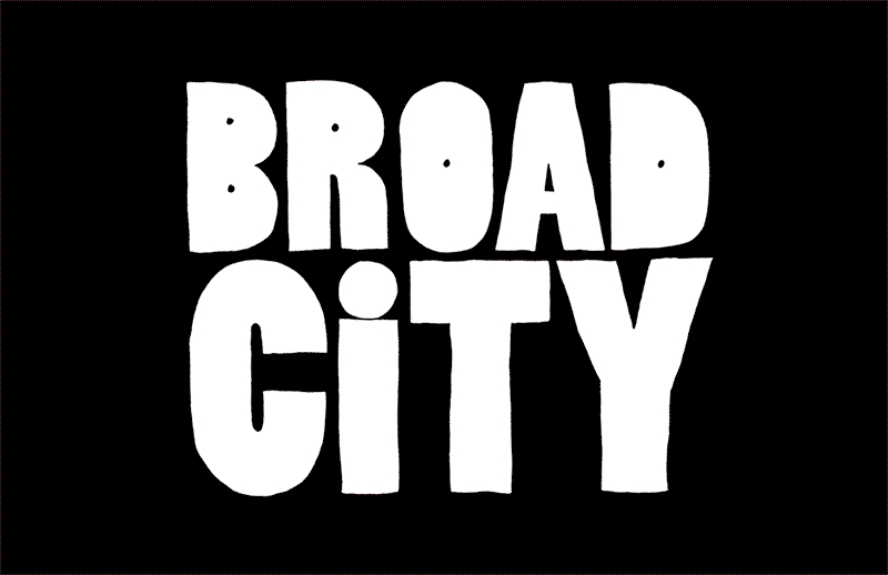


“Four and three and two and one-one!” Fans will recognize the opening countdown to Broad City, that revolutionary feminist show on Comedy Central. Each episode has a different invigorating title animation powered by the hand of Mike Perry. Like a DJ, he instigates the energy in the room with everything he makes. Prolific in both design and art, he is a genuinely happy dude, and the joy in his work is contagious.
Juxtapoz: What adjective best describes your aesthetic?
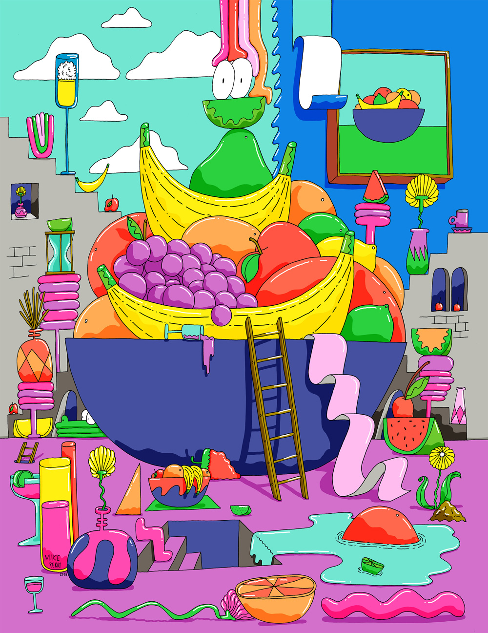
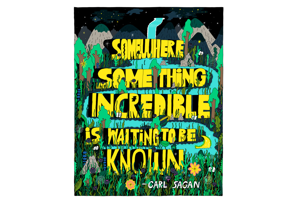
Mike Perry: I don’t know if I’m allowed to use the term, but I’ve been playing with the idea of Pop Surrealism. I’ve been in a surrealistic headspace for a while, but I didn’t realize it until I started to do a little research. I was always interested in art history as a concept, but never found it relevant. The older I get, the more comfort I find in history repeating itself, and in theories and methodologies. I got introduced to some of the bigger principals of Surrealism and thought they were amazing. If I could go back in time and hang out with anybody, it would be the Surrealists. I know Pop art is a thing, and I participate in pop culture, and I like those two things combined into this goofy, banana-filled, fluorescent pink landscape.
Tell me about your upcoming show of paintings.
I’m attempting to push the Pop Surreal aesthetic, but at the same time, go back to this world of historical art by celebrating the classic elements: the figure, the still life and the landscape. There will be some naked people and some weird bowls of fruit. I’m just trying to be painterly and feel good and loose about it.
What’s a new skill you’ve recently picked up that has changed your work?
Animation has changed my life completely. I didn’t even know I was interested in it until I did the Broad City stuff. Working with the element of time is a completely new universe to me. When things you make can suddenly move, they exist in their own realm in a way that you no longer have control over. It’s incredibly refreshing.
Broad City is a hit and your work sets the tone.
I’m a very fortunate human being because of that.

It’s all hand drawn?
Yes. It’s all frame-by-frame.
Have there been other significant shifts in your work?
I made that book, Hand Job, in 2003. I was really into type and drawing a lot of it, and then I realized type was a whole separate industry in itself. When you get some kind of credit for something, all of a sudden you have to fight against being pigeonholed. I just want to be the person who makes things and has the best answer for the problem or question at hand.
Would you like to recite your most recent poem?
I have a painting and show title that is kind of a poem—Intoxicating Pollen Wiggling in the Moist Journey of Constantly Blooming Tides.
That’s a very visual title.
It’s a complicated pile of words. I like words and how they look on the page. I’ve always had a hard time spelling things and putting words together, so I think that’s led to being really visual so that I can remember what words look like in order to spell them correctly. I had a period of time where I was writing poems and wanted to share them, so I made these incredibly complicated typographic pieces that had the poems in them but were nearly impossible to read.
What’s your favorite word?
My wife is named Anna, and I really love her name because it’s so fun to draw. I also like things that start with the letter W for some reason. I really like the word wiggly. I try to use it in sentences regularly.
Do you have any current obsessions?
Blue. I’m deep into the blue world.

How long has this been going on?
It’s probably been a year or two. Sometimes I want to change my palette, just because you get so used to using colors that you like, and you wonder if it’s becoming too easy. Fluorescent pink is a great color and has its own power, so then I wonder if it’s a crutch or something. I try to mix it up, but it makes me happy, so who cares? I tell myself to just chill out and use the pink.
Do you think it’s the happiest color?
For myself, I think the happiest color is a really beautiful, sun-kissed yellow color.
Someone recently told us yellow represents anxiety, but yellow is usually a happy color.
It’s so impossible to have any idea of what other people are grasping from—that complex truth about color and the way everyone sees it differently is crazy. I feel pretty comfortable with my use of color as a concept, but I know that some people are colorblind and don’t register all of the values because they see a different spectrum.
It would be interesting to ask a lineup of people to look at your work and compare how they see the colors.
But then what would you do with that information?
The mystery is often better than the facts.
Big time.

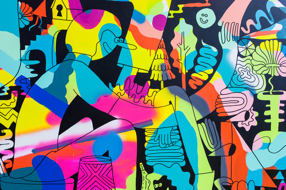
Mural at Facebook
Are there any recurring elements in your work?
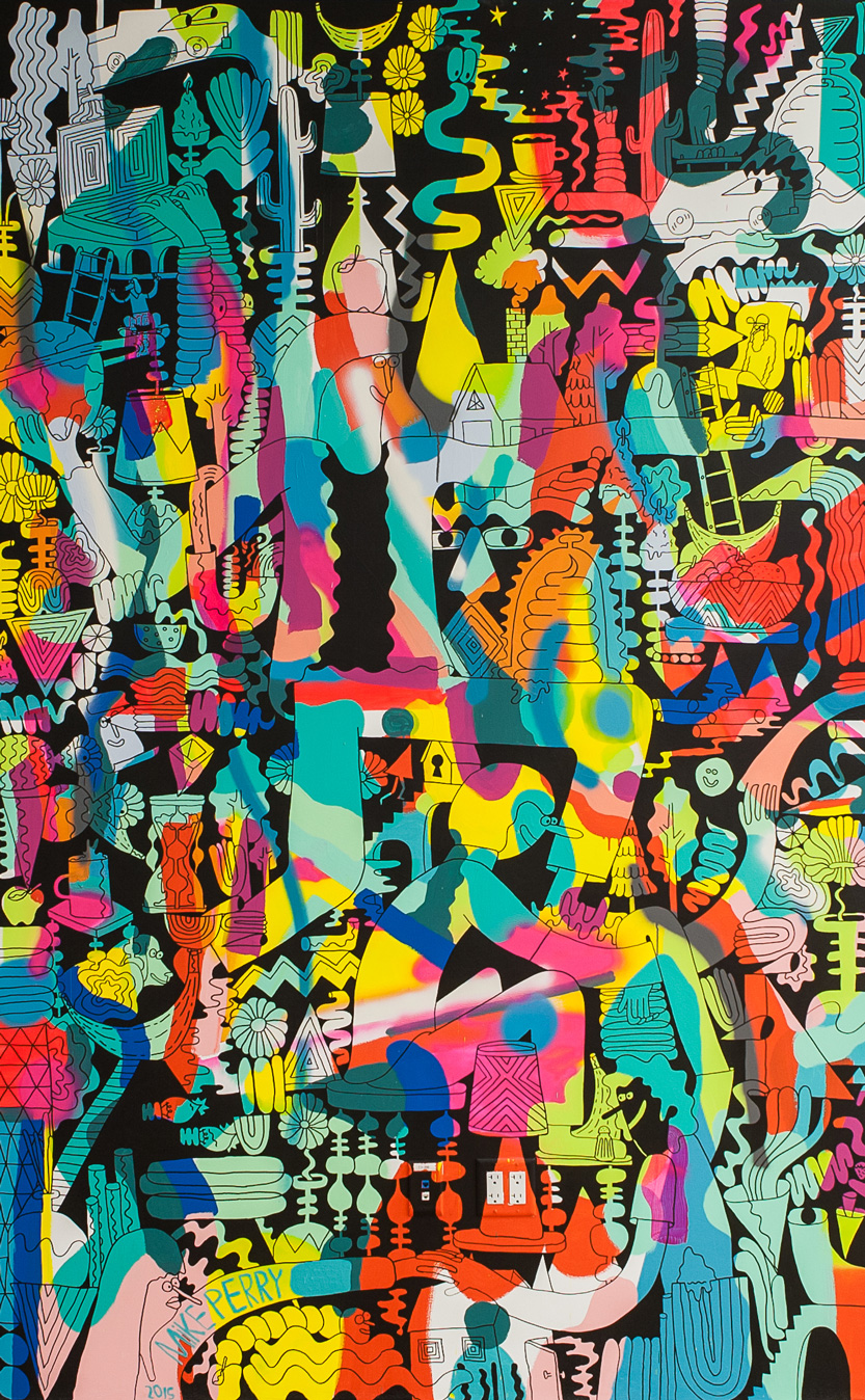
I’ve been drawing that starburst asshole shape for a long time. It always feels very satisfying. I’ve introduced the daisy flower shape into my work, and I take such great pleasure in drawing fields of grass with flowers. I also like the rainbow shape without the colors, just the lines.
You once said you like silence in your artwork, which was surprising because it sometimes feels loud and busy (in a good way).
You say that, and I’m sitting here staring at this painting, and it’s utter fucking chaos. Did I really say that? I spent a bunch of time making these spacey watercolors, and I called them little universes or starscapes. I always thought those were quiet, but maybe they only feel calm to me because I get to look at them and feel a sense of accomplishment. It could be my own personal point of view.
One of my favorite things to do is to stack things in drawings, so there’s like a fictional gravity. It feels like when you put a house of cards together—you suddenly get really quiet because anything you do could knock it over. Maybe it’s something like that.
----
Read more in the April, 2016 issue of Juxtapoz, on newsstands worldwide and online here.