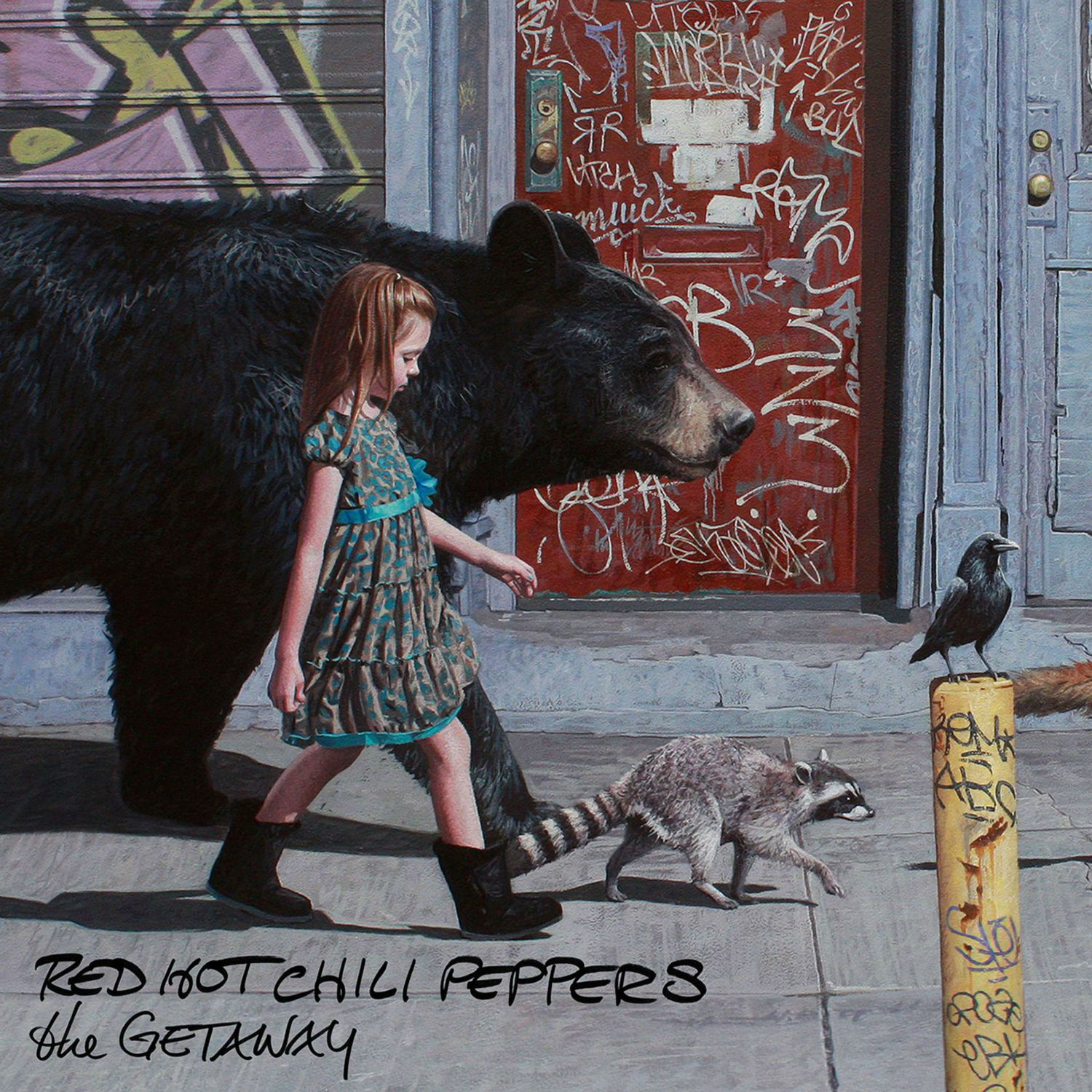
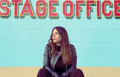
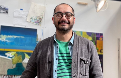
I always hate seeing an awesome album cover with credit to the artist nowhere to be found. Scour Instagrams and Tumblrs looking for an answer, and you might conclude that an anonymous gift was bestowed upon a band to represent their creative output. But when it comes to the newest Red Hot Chili Peppers album, The Getaway, the art is so identifiably Houston-based Kevin Peterson’s, no extra research is needed.
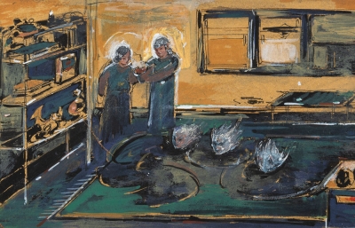
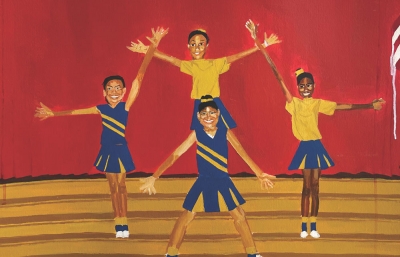
That is the great advantage of having a style and precision all your own. We sat down with Peterson on the heels of the album’s release and talked about his new body of work set for a solo show at Thinkspace Gallery in Culver City this August and why the children he paints aren’t afraid of the future.
Read the full interview in the September 2016 issue of Juxtapoz Magazine.
Evan Pricco: First off, congrats on the Red Hot Chili Peppers album! How did that come about? Did you get to meet anyone in the band?
Kevin Peterson: It’s pretty surreal to see your painting on a billboard or at freaking Target! I guess Anthony Kiedis saw the painting online and showed it to Flea. They were into it for the cover, but they didn't even know who the artist was. Flea shared it on Instagram and his followers quickly pointed him in my direction. I didn't know about any of this though, until I got on my Instagram later and a bunch of people had tagged Flea in some of my pics. He had already deleted the pic of my painting. So, I was just like, "Huh, what is this about?" I just forgot all about it, but about a week later their manager called and said the band was interested in using the image for the new album.
I have not met the band, but they will definitely get the invite to my show at Thinkspace Gallery when I'm down in LA in August.

In the Juxtapoz Hyperreal book, you talked about being a realistic painter, but that your scenes are "rarely actual moments in time." Considering that the work looks so cinematic, how do you prepare? What’s the process?
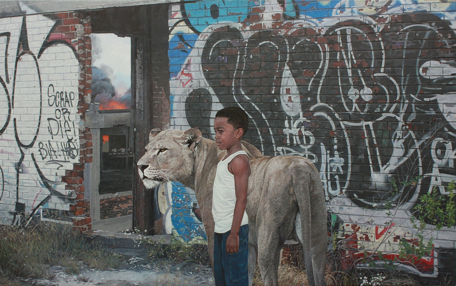
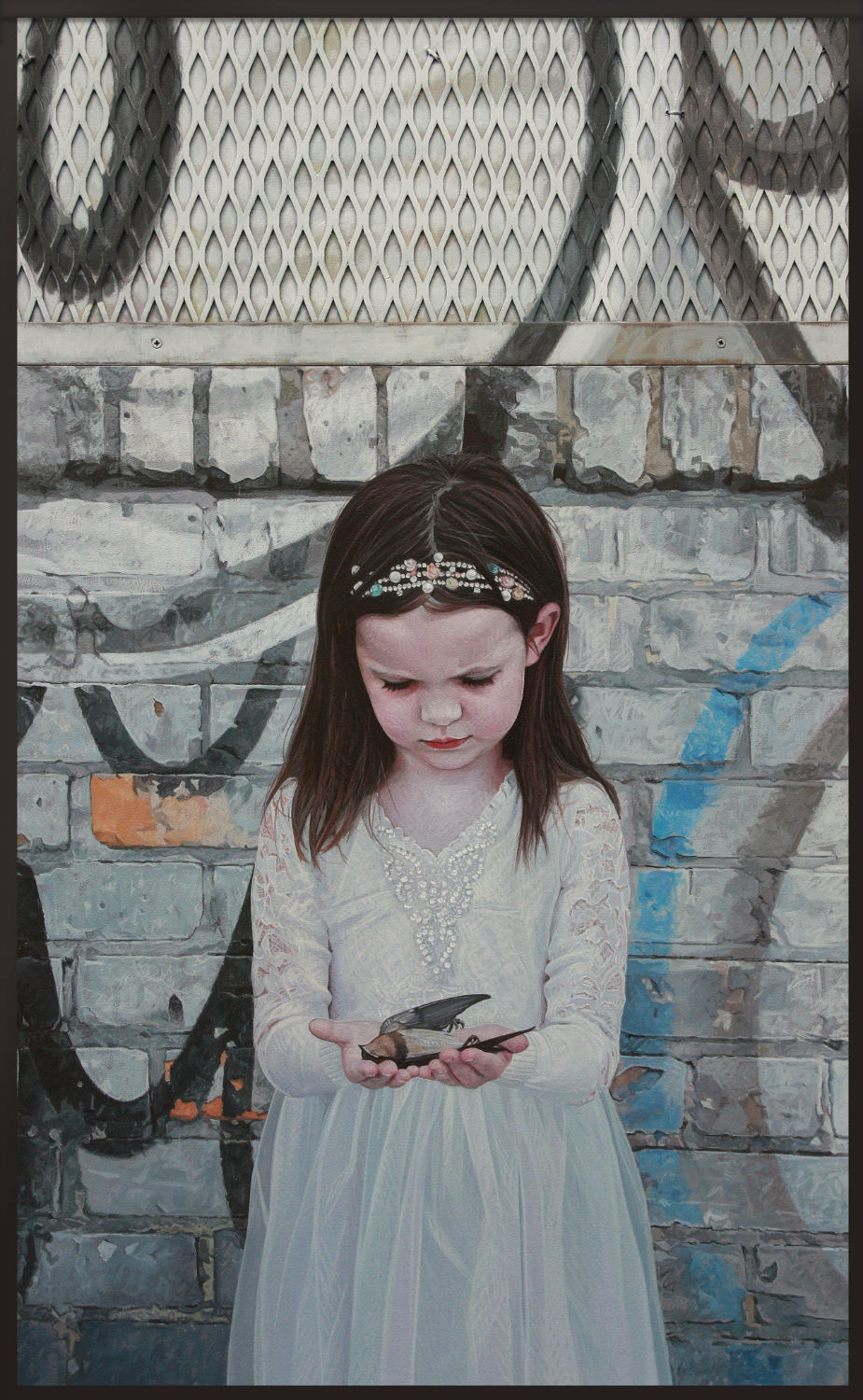
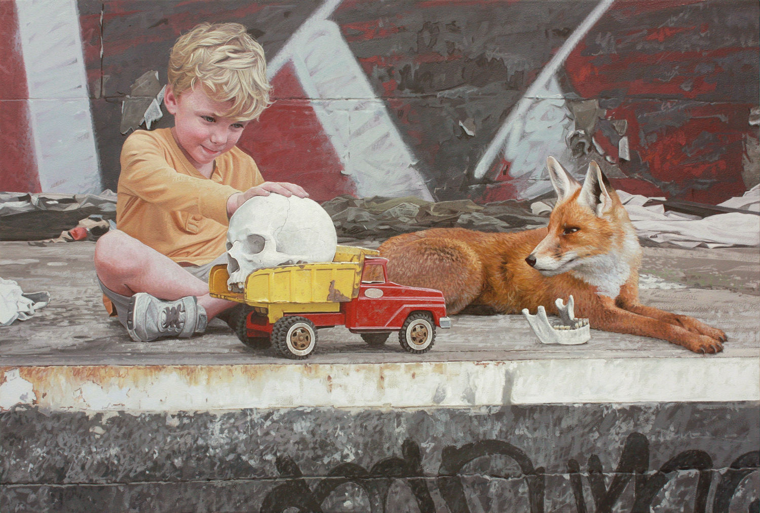
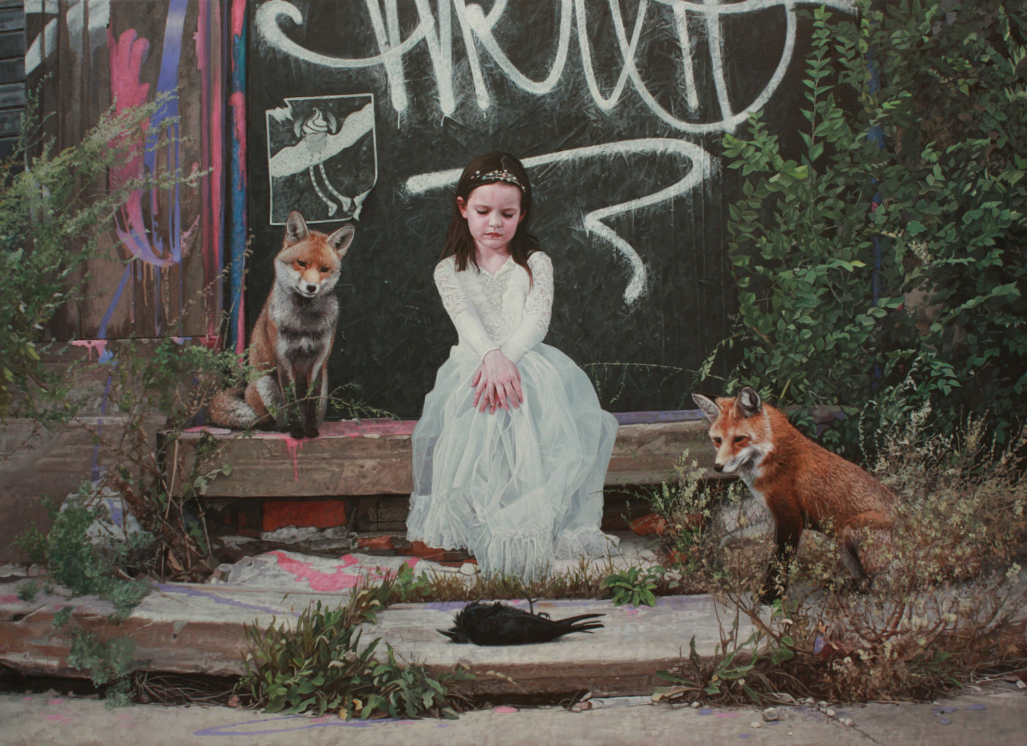
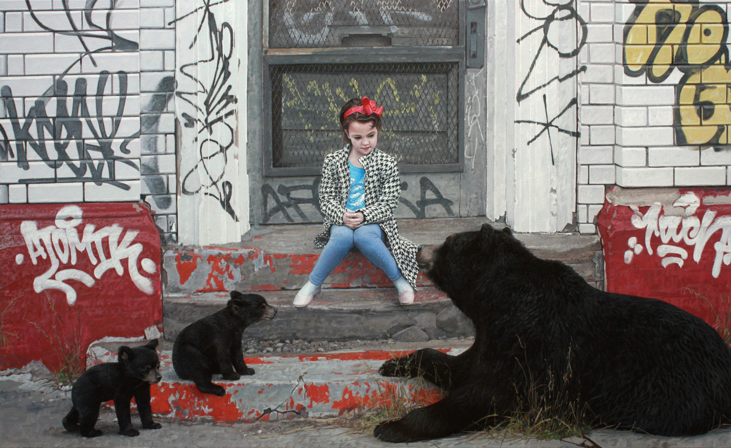
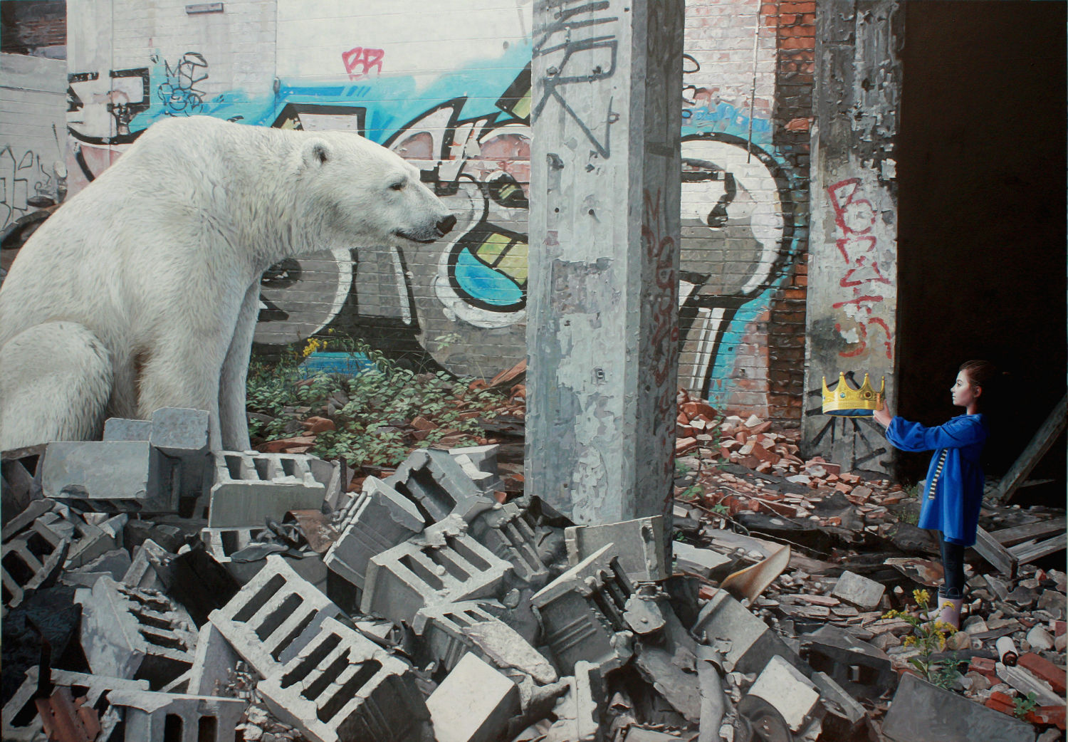
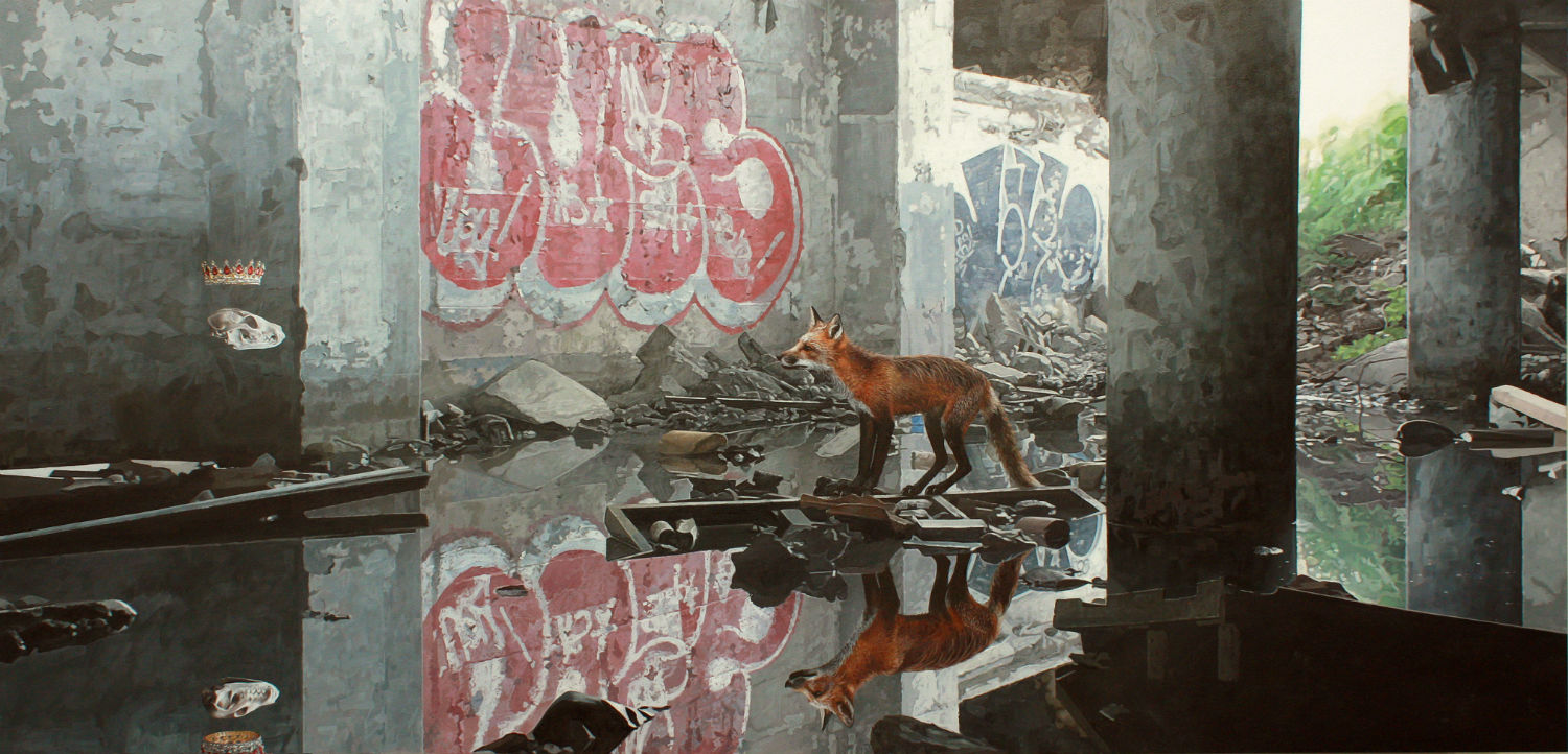
Sometimes I start with a background image I like and sometimes I start with a picture of a model I want to use; it doesn't always come about the same way. I work pretty closely with my reference photos, but the final scenes are composites of my images. I have tons of images of urban blight that I've taken over the years, and I also have lots of pictures of models that I've taken at my studio. I use Photoshop to lay out a composition that I will use to paint from. The Photoshop composites are never perfect, though; they are a framework. The challenge comes in working out all the details during the actual painting process to make the scene come alive. My goal is to create a scene that is both implausible and fantastic, but at the same time, totally believable to the viewer.
The new work looks, dare I say, a lot more post-apocalyptic? Not in the “end of the world” sort of way, but also not subtle, as in The Leftovers sort of way. What ideas and themes were you channeling?
I don't believe in an end of the world, apocalypse-type situation.The earth will persist, but the only question is what stage it will be in. Time and how things change over time are always themes in my work. I like thinking about our world in different stages. Seeing how the things we make crumble and decay. Seeing nature take over when it’s allowed to, but even nature is cyclical. A forest burns down, but it grows back stronger. It’s just a matter of time.

The kids you portray never look scared, even though they are in situations that perhaps should cause alarm. Is that an accurate description?
Yes, that's accurate. They're not scared. It’s hard for me to explain exactly what the look on their faces is saying. Contemplative might be a good word for it. They're considering this new world where things are crumbling, but it’s not a reason for fear. It’s a new beginning, a clean slate. I personally hate and fear change, but it’s important to remember that change can lead to good. It can make you adjust your trajectory, reevaluate your priorities. I suppose the kids in my paintings are a reflection of a hope that I have that people will learn from past mistakes and face the future with a sense of calm reason.
Over the past few years, Texas has emerged as an art center. Has that been exciting to see evolve?
Yeah, it’s a good place to be as an artist. There seems to be a good appreciation for art here. There are amazing collectors, there is money here, affordable studio space, so it all works together to make a nice creative environment.
Who are some of your favorite artists making work today? Who gets your juices flowing for your own work?
I love Jerome Witkin. The work of Josh Keyes has always meant a lot to me. I love Aryz and Etam Cru. Simon Stalenhag, Tim Lowly, John Brosio, Colin Chillag, just to name a few.
----
Originally published in the September 2016 issue of Juxtapoz Magazine, available here.