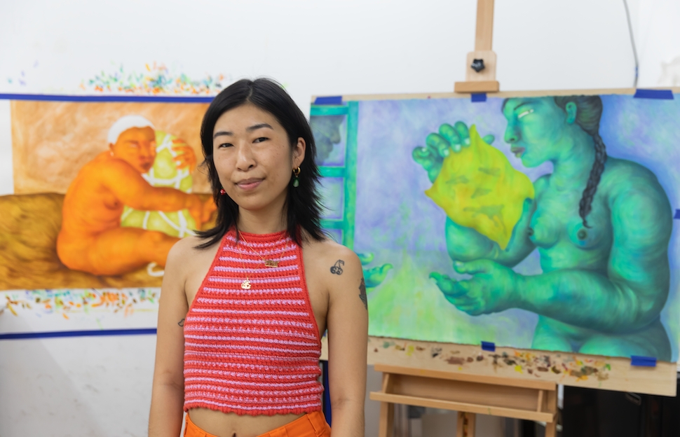
Lily Wong
The Lightseeker
Interview by Anthony Cudahy // Portrait by Laura June Kirsch
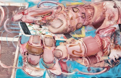
As with many artists, Covid-19 disrupted and changed Lily Wong's practice. Her figures, once rendered tiny and placed in maze-like environments, began to fill the frame, twisting and swelling into their own claustrophobic architecture. Color began to exert an intense, metaphorical force, often glowing and luminous. The works on paper grew in size, doubling and tripling in surface area, while Wong's intricate process of mark-making and building up of the paint grew in exponential complexity. This partially portrays the power these figures and narratives possess, but the impetus is Wong herself, as deep and considerate a thinker as she is a deft creator. We met in her Greenpoint studio in early June to discuss her influences and concerns, as well as the major changes the past year has made to her practice.
Anthony Cudahy: So I watched Happy Together last night, and actually you said you hadn’t seen that one?
Lily Wong: I need to. The classics for me are Chungking Express and In the Mood for Love. There’s a website of stills from Wong Kar-wai’s movies I use for color inspiration. But here’s the thing, I feel like such a fake [laughs]. I always feel like an outsider, like six-feet-removed from these experiences that I don’t necessarily have a physical history with but have a lot of attachment to. I love to look at all sorts of anime but I’m not invested in any storylines, I’m watching for the animation styles or the colors. Or in referencing Wong Kar-wai movies, I always get this imposter’s syndrome mixed with a false nostalgia because so many of his films are from a specific time and place in Hong Kong, where my dad grew up. I secretly associate feelings of home with it, but I’ve never been there, and I know very little about my dad’s family. It’s like being very hungry for something you have no ability to access, but knowing that part of it also is embedded in you.

Isn’t that the impetus of creating and looking in general? You might not be on the same wavelength as everybody else, but you’re definitely recognizing something. There isn’t just one way to appreciate or have a dialogue with the cinematographer or even your own personal feelings about your father.
That’s true, and I’ve been trying to give myself more grace. I had such a hang-up about that in school, feeling I had to factually prove my reality like, “I know this lineage. I know this history. This is what I’m referencing.” That’s not necessarily my approach. I have what I’m interested in and create a whole fantasy around it. I get so deep into that fantasy that it becomes completely detached from the real thing.
I’m reminded of “Utopia’s Seating Chart,” the Muñoz essay. He draws all these connections so intuitively. It’s not so much a linear way of thinking, but more of following coincidences and interests. It’s less hierarchical. In focusing on the backdrops of anime or the color scheme of a film, you’re still engaged in dialogue with the art.
I’m leaning into that more. The progress that I’ve made in the past year is because I haven’t had the noise of school in the background, and not having to defend myself in class, where it feels like everyone wants you to have this incredibly synthesized view of your work and interests.
I love Japanese woodblock prints and Mughal-illustrated manuscripts, stuff that pulls from folklore and Eastern mythology. Cave paintings, too. I’m also very drawn to imagery that’s rooted in pop culture aesthetics of of our childhood, especially cartoons, but the way we’ve been taught to think about any of that is completely divorced from “art” or painting with a capital P. It’s all outside the Western canon of art, which was rarely the dominant lens I was looking through. I never really know how to explain why I’m so drawn to paper, but I’ve been thinking about that a lot more lately, and how paper is foundational to so much of what I’m interested in. From my educational experience, few people talked about these ways of making in terms that school validates. I don’t know how to talk about Sailor Moon academically, but I know something important is there! Millions of people globally love that aesthetic.

Sailor Moon is, specifically, some of the first art that I was obsessed with.
That was the earliest thing I remember consuming on television.
This hierarchy, whether on paper or the way certain things are rendered, is especially present in color. I feel like when we graduated undergrad, there was a whole color world that was “not allowed.”
Especially bright, saturated Pop-y colors—there wasn’t room for that, but a lot has shifted since then. In my work, I’m trying to embed this radiating glow that I realized comes from television screens. I tried to exactly color copy a still from Wong Kar-wai’s Fallen Angels. I held swatches to the screen and everything matched, but it wasn’t working because so much of that glow is the way the device creates and projects the light.
Color can be such an ephemeral goal, and with you, it’s a different medium, although the way that you layer on paper is similar to screen light because the paper glows from beneath.
The glow when my work was only in black was just the stark white of the paper. I started diving into color shortly after I switched from ink to acrylic. I felt all this pressure—I tried a couple things on linen, which I hated. It’s not the same. This year, having to get to know paper again through a different medium, and using color, I feel like I understand it better, and what its function is. Some woodblock printing is like that too, really thin layers of color, printed on top of each other.
I’ve been looking at Yoshitoshi’s 100 Aspects of the Moon series. Each print is based on historical anecdotes or mythology, and I love how the intensity and energy of each story is captured so elegantly on this fragile paper. There’s one print depicting the goddess Chang’e fleeing to the moon after stealing the elixir of life, which is sort of beautiful and romantic. But in several versions of this story, her now immortal life is spent on the moon, forever making the potion with her rabbit companion. It’s quite Sisyphian, this unattainable elixir.
I think many modes of Asian art making are not a quick read. With Mughal manuscript paintings, the narrative isn’t on a singular plane. It’s embedded in multiple perspectives and timelines smushed together. Or with Chinese scroll paintings, it’s like a slow circular read where absence or negative space is what activates minute details. This concept of the essence is super important, capturing something that is ephemeral. I think that’s why I love drawing and the language of cartooning. It’s so digestible, but what you see is hardly ever what you get.

A lot of your pieces remind me of Giotto. Italian Renaissance art moved towards hierarchical images afterwards, but he consolidated the Byzantine jam-packed space, and color is narrative, which I feel relates to you.
That’s what I’ve been finding really exciting about color. In the past two years, my work has had a big scale shift, and I’ve zoomed in from multiple narratives into more singular ones. I’ve had some guilt about that because I felt like I was conceding this part of image making that’s really important to me, like hiding these Easter eggs that create this cyclical read. Especially when the work was still just black and white, it really felt like something got lost. But, moving into color, especially yellow, was a spark. Color is where the narrative subtleties are being embedded now. Color changes the way an image reorients your eyes when navigating a space. When I was working smaller and in a different compositional style, I could insert everything I was thinking about but I’ve really had to rein that in.
Architecture was really present before, but now figuration and color are their own internal architecture. A big part of your thesis paper and work was the intentional use of yellow formally and metaphorically.
Before, there was so much ornamentation and adornment used as cultural signifiers, but I felt like that was setting the undertone of the work in a very restrictive way. Yellow can be used as the same sort of thing while also activating and navigating its position in our collective cultural memory. It also functions as a visual tool, light-wise.

I was thinking about Contact, where yellow functions as the saturated color that’s coming at you, but then it’s also this omnipresent stain.
Stain, yes. Residue, remnants... I’m super interested in the Veil of Veronica right now and the idea of this leftover imprint of a face being a “true” representation of the actual person. The cowgirl piece (Contact) is the most explicit use of yellow. Using yellow as a descriptor for people is still so tainted by its violent history. But “Asian-American” is too vague and I can’t possibly pin it down. For myself, yellow is actually very accurate and speaks to my own history, and I almost can’t use it because it makes other people so uncomfortable. So it’s not really a reclaiming, but a reinforcement of its existence.
I also think about the Korean concept of han as a repetition of suffering, another type of cultural stain. In carrying that, you’re always revisiting this site of conflict or injury or pain. But to exit that site means having to go back through the way you came. I think maybe that’s the function of yellow in my work. I get nervous though, because that’s a piece of myself I don’t want to give too much of because people will hold on to that really hard. That’s where the title for my most recent show, I Wasn’t There, came from. Whenever you reach a sort of understanding or feeling of resolution, there’s always something else to disrupt and unmake that sense of self. In Minor Feelings, Cathy Park Hong writes about often existing in this place of conflict and of having to hold multiple truths at once. I think that’s a super uncomfortable place for people to exist. We want things to be binary, and nothing is.
The art world has such a simplified view of systemic issues and identity, which are weaved into everything. What you were saying about not reclaiming is an important distinction because artspeak wants to frame things as “antagonistic to this,” or “subverting this,” but when you’re trying to examine your experience, it’s never going to be that neat, tidy package. There will never be a moment of having arrived, as if laying claim to...
...Like “wipe your hands,” done. That's a challenge I’m trying to navigate. For the longest time, I avoided talking about any of this, because then I’m pigeon-holed. It gets especially fuzzy when it comes to Asian-American identity, because it occupies this enormous swath of in-between space of hypervisible non-existence.
How do I talk about trauma and give just the right amount? Because once you reveal it, it’s so hard to walk it back. I feel like whatever direction I choose, there’s always another part of myself that’s being denied. I did a studio visit today and wondered how much am I going to tell this person?

It almost feels that in revealing a trauma, it’s the finish line. Instead, it’s more of an important detail that you can now enter. It’s the beginning.
It’s just opening the door, but people get stuck there. And even when you express this frustration with trauma-gazing, then that gets framed as “the thing.” It’s a loop. In school I was trying to package everything in a linear way. I’m trying to now have a more instinctual conversation with different parts of myself and figure out the various access points I want to provide.
In those dialogues, there’s almost this reification of the idea that someone different from you isn’t fully human. There are material, historical differences between people and their experiences. But when you have this sort of artspeak notion of identity, you never truly engage personally.
You’re engaging with the idea or projection of this person.
The worlds that you create are open-ended. It’s the first step and it’s generative, never providing a packaged, prescriptive statement.
You’re going to love Chungking Express. It’s multiple parallel stories with no real conclusions. Even the synopsis doesn’t capture it because it’s experiential. The main characters’ stories are almost completely separate, except for several brief, shared encounters. And their relationships to each other are mostly through fragments of the other person or fragments of shared space. Within those tiny slivers of urban space are these narratives around longing, desire and aching, all allowed to exist in the muddiness. This thing we are trying to grasp at, the second you have it, it’s out of your reach again. There’s an awareness of that—it’s not trying to be tidy.
Happy Together seemed on your wavelength because the film constantly shifts between black and white and extreme color. It’s the Wizard of Oz technicolor reveal, but twenty times. And every time the color returns, you gasp.
This concept of hybrid, fragmented selves is always present and I think of that black-and-white work as another split self. Those aspects of the self are always in flux, but it’s never the singular unified self that reorients to various environments. It’s the multiple consciousnesses all reorienting at the same time, like the Coney Island ferris wheel. Not all the carts are stationary. Some do a scary thing where they move as the wheel is going around. You’ve got your whole container of self in motion, and then within that there are different components also in motion.

It makes me think about the malleable material of your figures. Parachute is disturbing.
My first Covid painting.
Flesh is imprinted in such an extreme way that it deines every figure after, even if they’re not that contorted. There’s this possibility that figure could collapse or coil into itself.
The figures in the earlier pieces are more distorted and bulbous. I initially thought of them as balloons filled with this tension that could explode. Lately it’s lost a lot of that… still malleable but not as overstuffed. I think that’s been a little transition.
When I finished Covered, I revisited Parachute and saw it as an activator. At first I felt that I had to make everything weird and twisty, but then it made me think of the ways that the body can be distended or extended outside of the physical frame.
You know Maia Ruth Lee? I loved her Bondage Baggage series documenting luggage during her travels back to Nepal. It triggered my own memories, especially from the ’90’s when there was a large wave of Korean immigration. Every time I’d be at the airport, there were always loads of bags and boxes tied with string, all this life stuffed into smushed packages. When we visited family, our bags looked like this too. We were transporting our American life in these bags for our family to consume and yearn for.
In My Past Lives, the twine is actually her braid. In less exaggerated ways, the body is distorting itself. Those balloons had their place and maybe they will come back, but I didn't want that possibility to become so rigid.
You have form and function listening to each other.
I think it’s also the printmaker problem solver in me that’s like, “Well, I’ve put acid on this and can’t really reverse it,” so it’s half, “How do I trust the technical part,” and half, “How do I trust my gut?” That kind of mirrors what the work is about too.
Surprises come out of that process. What I like most in the idea stage is what I hate most in the end. I don’t often plan colors ahead of time. I just go for it, do one part and respond.
That’s how I paint too. It’s reactive. For me, it’s like, you have to put something down or it’s never going to happen.
I think it’s because we’re the kind of people who overthink, and it’s sort of like you have to run into the cold ocean or you’re never going to actually get in the water.
It’s almost better to do something wrong because then you have this insatiable drive to fix it.
That was a driving force behind Reach Out. I was like, this cannot be a fucking Hulk drawing! I made a green person. It’s chunky. I was so determined for it not to be that.