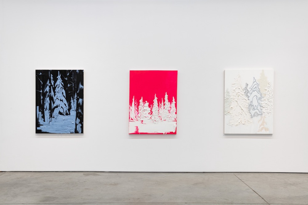
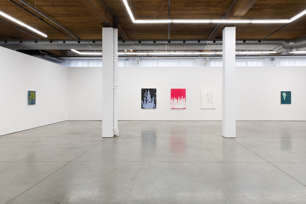
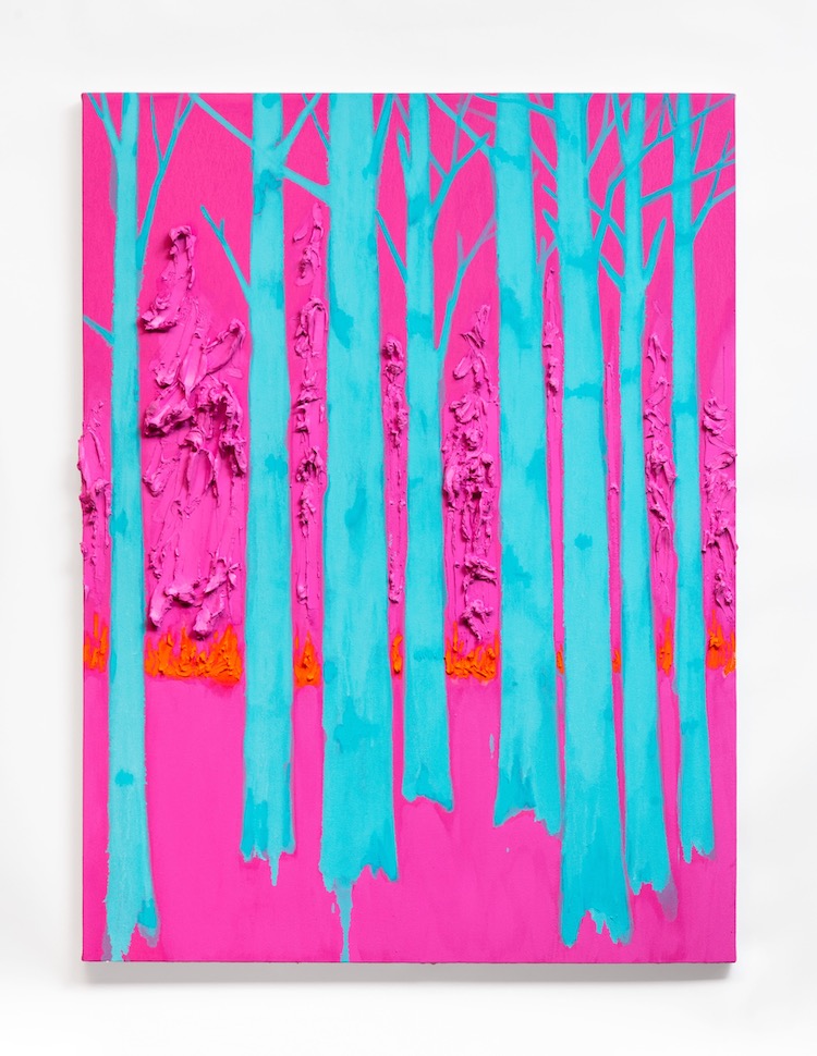
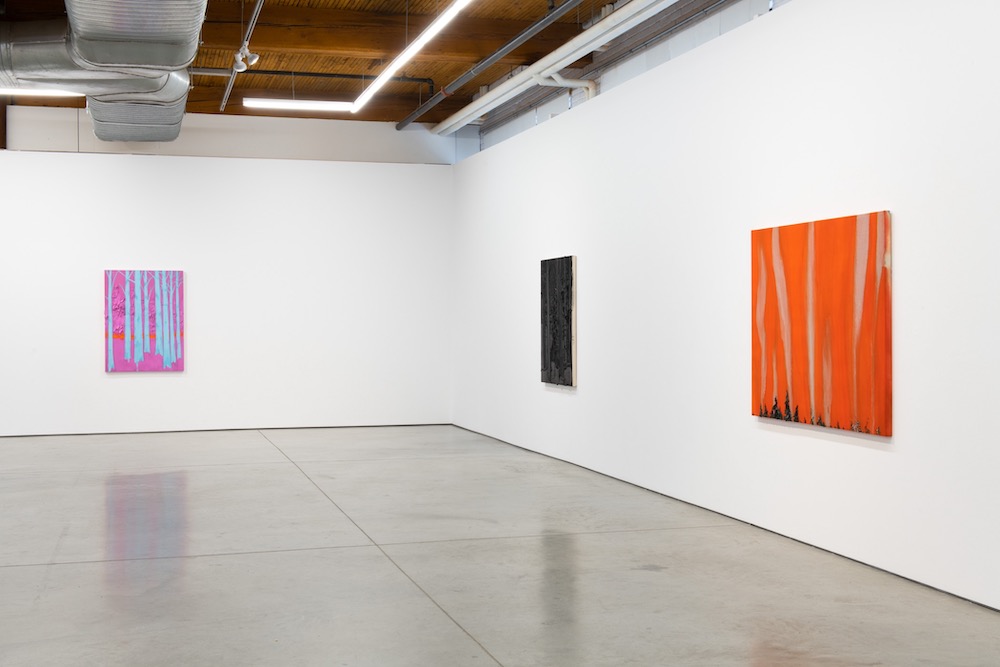
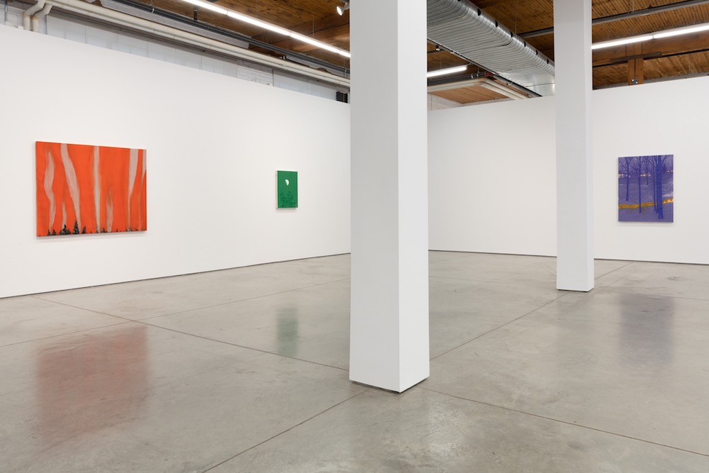
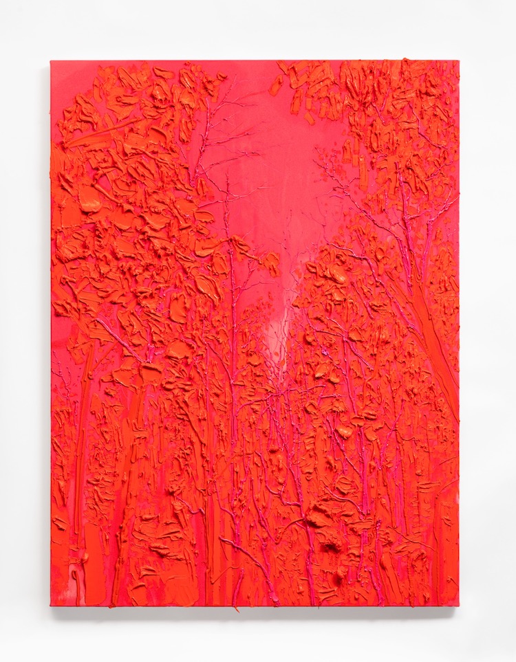
It is hard to picture conveying the ambiance of awe, a fearful respect, and disquiet, especially within a natural, wildlife environment, with the use of bright, vibrant colors. And for his latest exhibition which is now on view at Bradley Ertaskiran in Montreal, Kim Dorland decided to portray the iconic Canadian forest scenery with the brightest, most plastic-looking shades of blues, pinks, oranges, and purples.
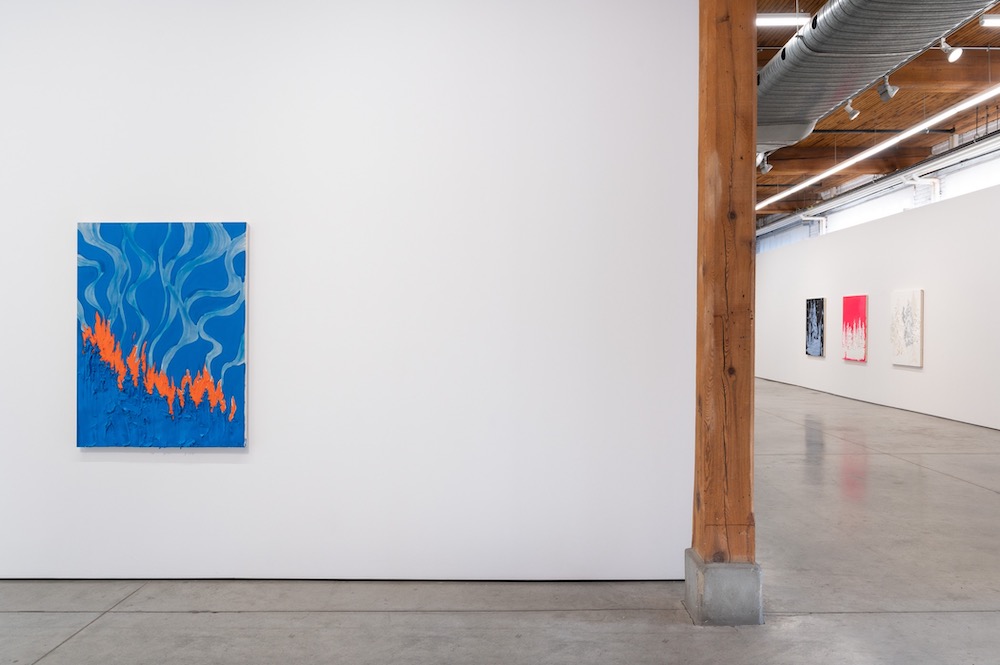
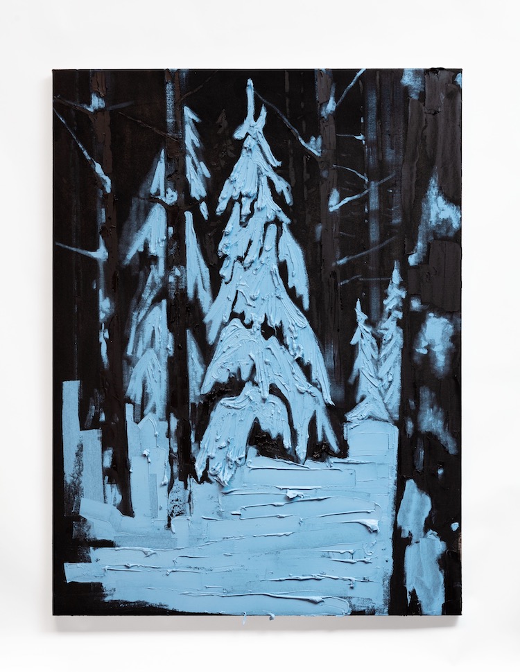
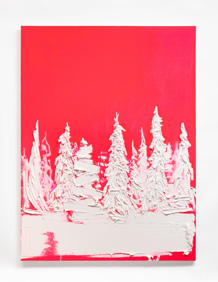
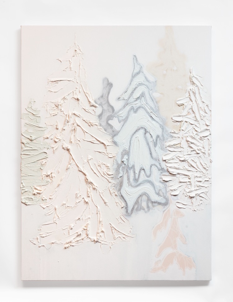
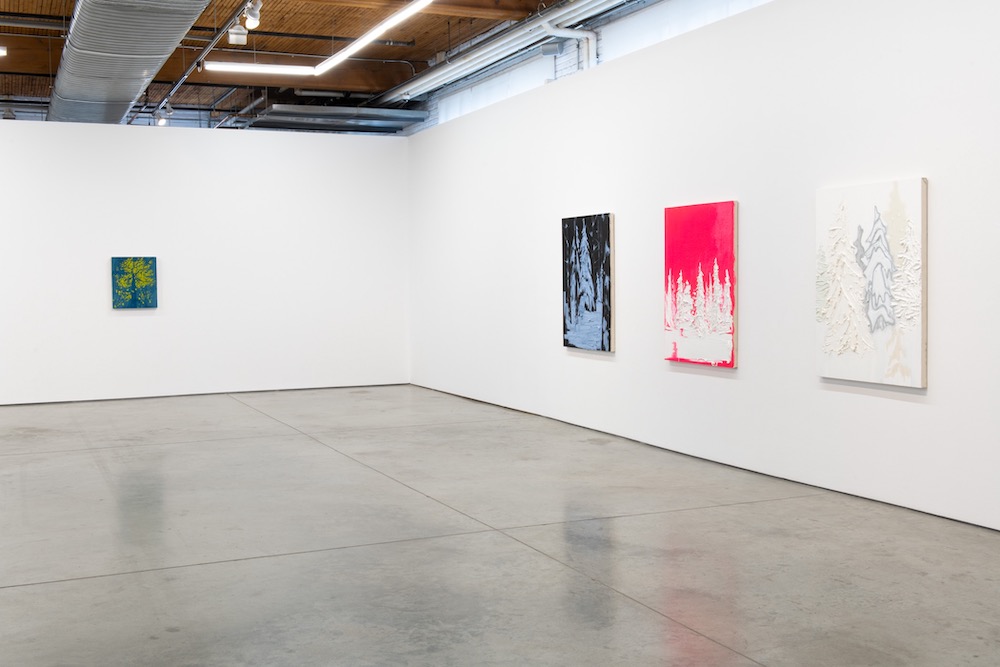
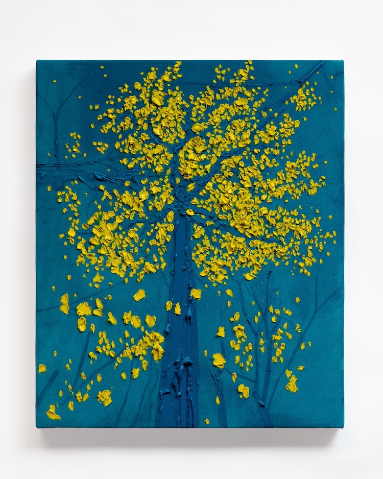
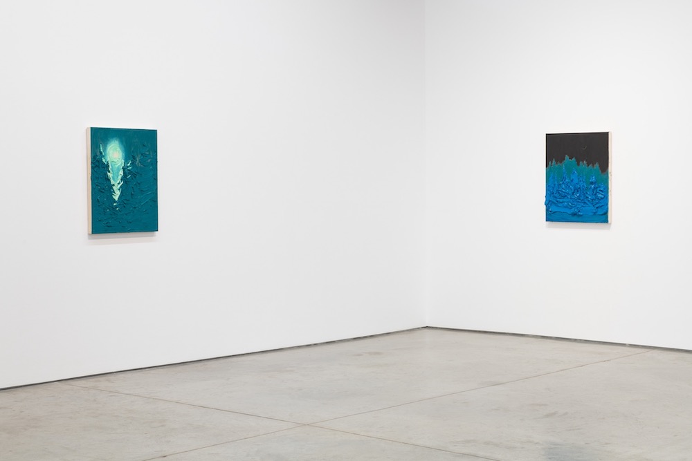
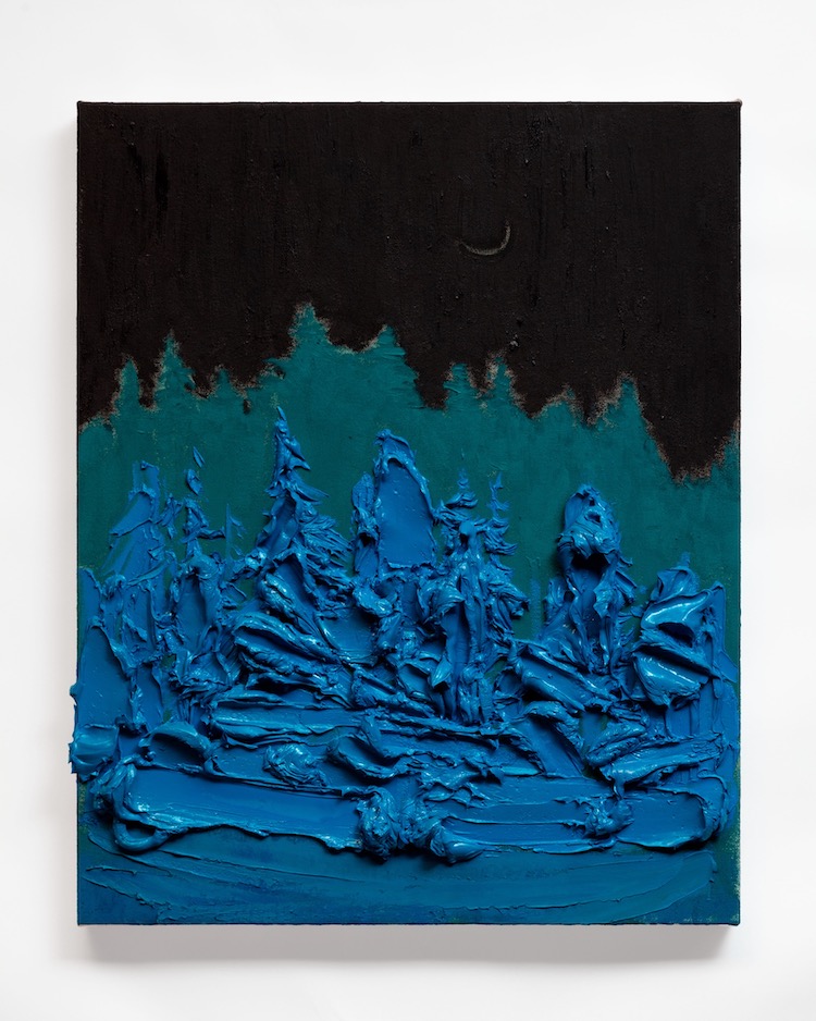
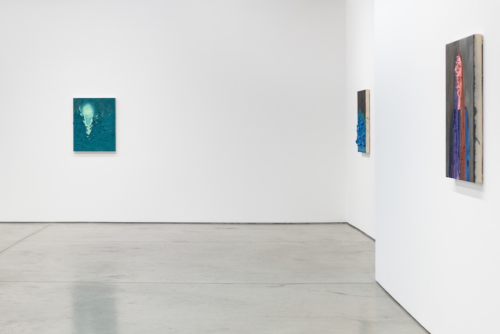
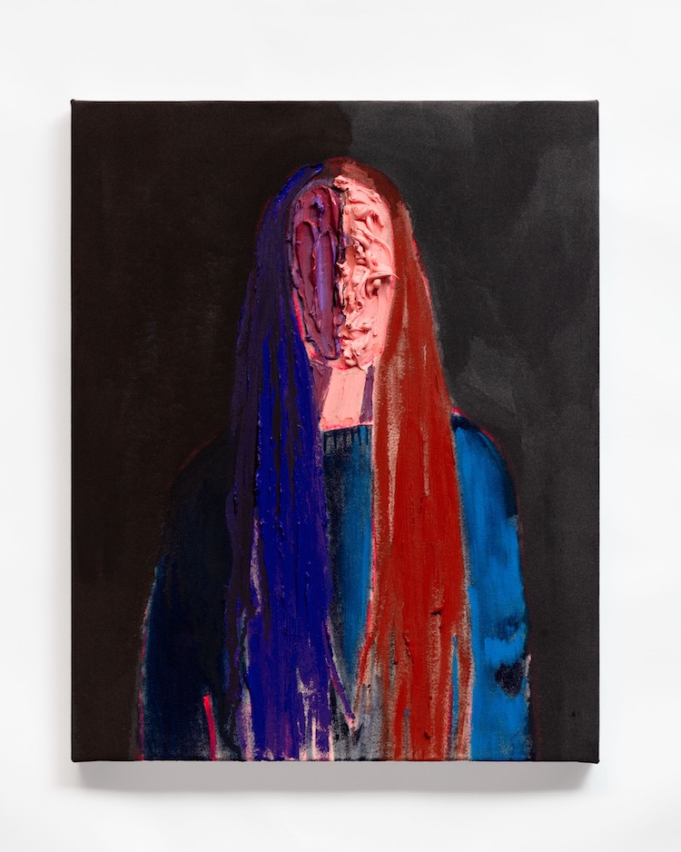
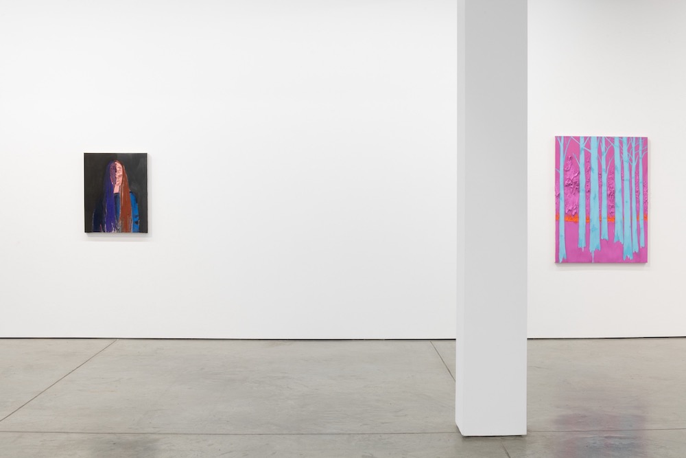
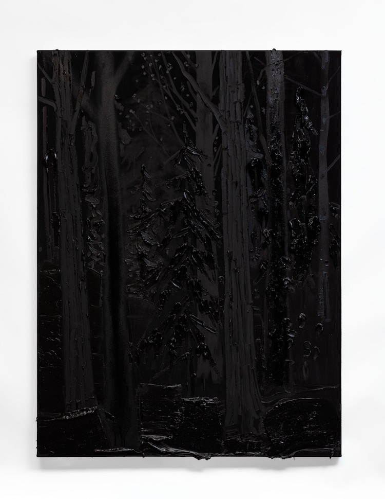
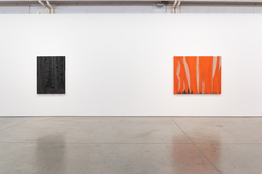
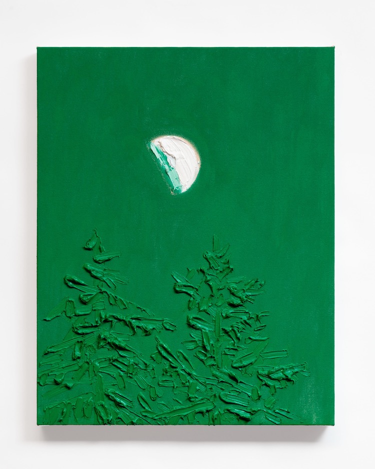
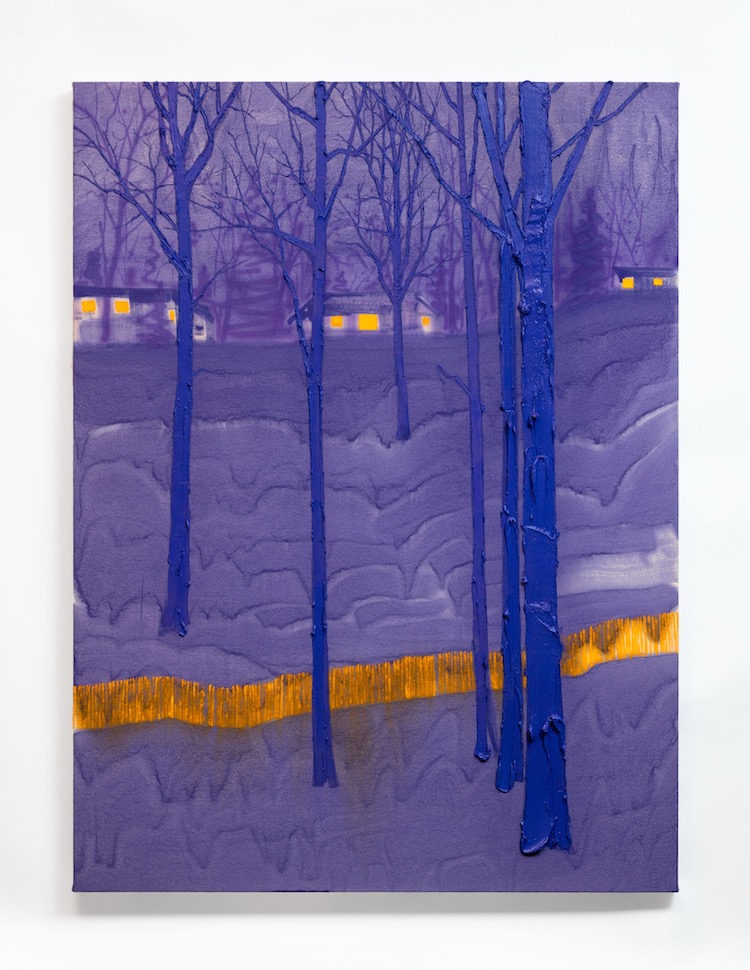
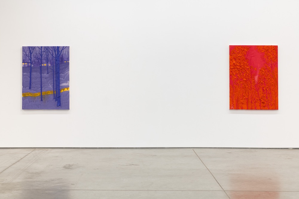
We've been keeping a close eye on Dorland's practice and have been huge fans of the angst and eerieness that are permeating his contemporary takes on traditional landscape painting. Regularly working with thick layers of paint, he is often reducing the existing formal elements of the vista he is working with and injecting it with a more intensified atmosphere through the application of unearthly, fluorescent hues. The bright pinks, radiating yellows, or glowing oranges, piercing through otherwise darkened settings in which pine trees silhouettes block the light and create a murky scene, became somewhat of a signature for the Toronto-based artist. And the effect of these electrifying hues took the front seat in the Landscapes, Colour, and a Portrait, which comprises hyper-colorful, semi-sculptural landscape paintings and one portrait piece.
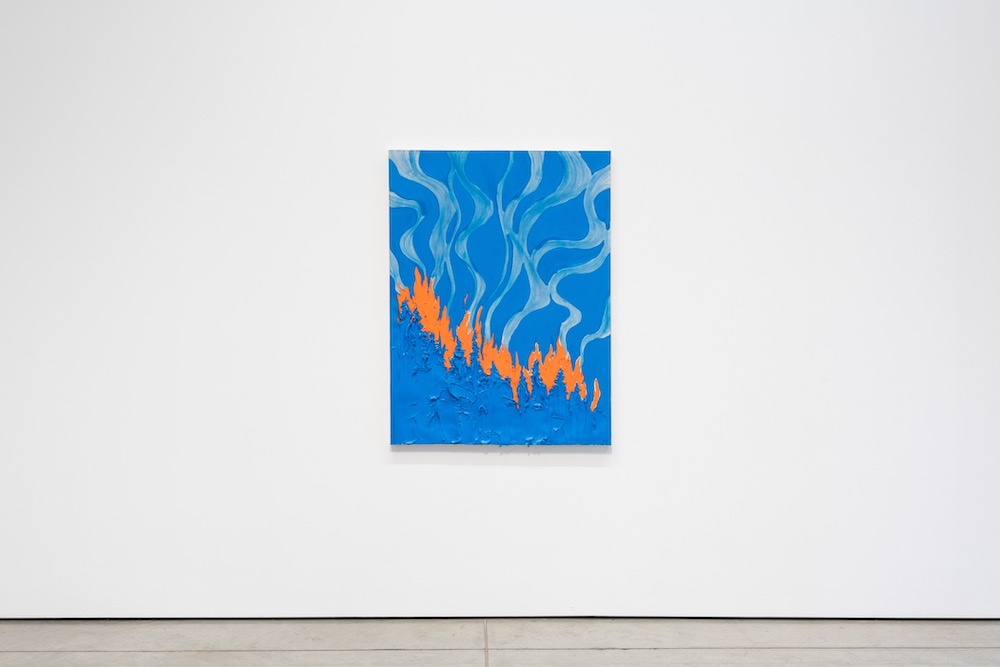
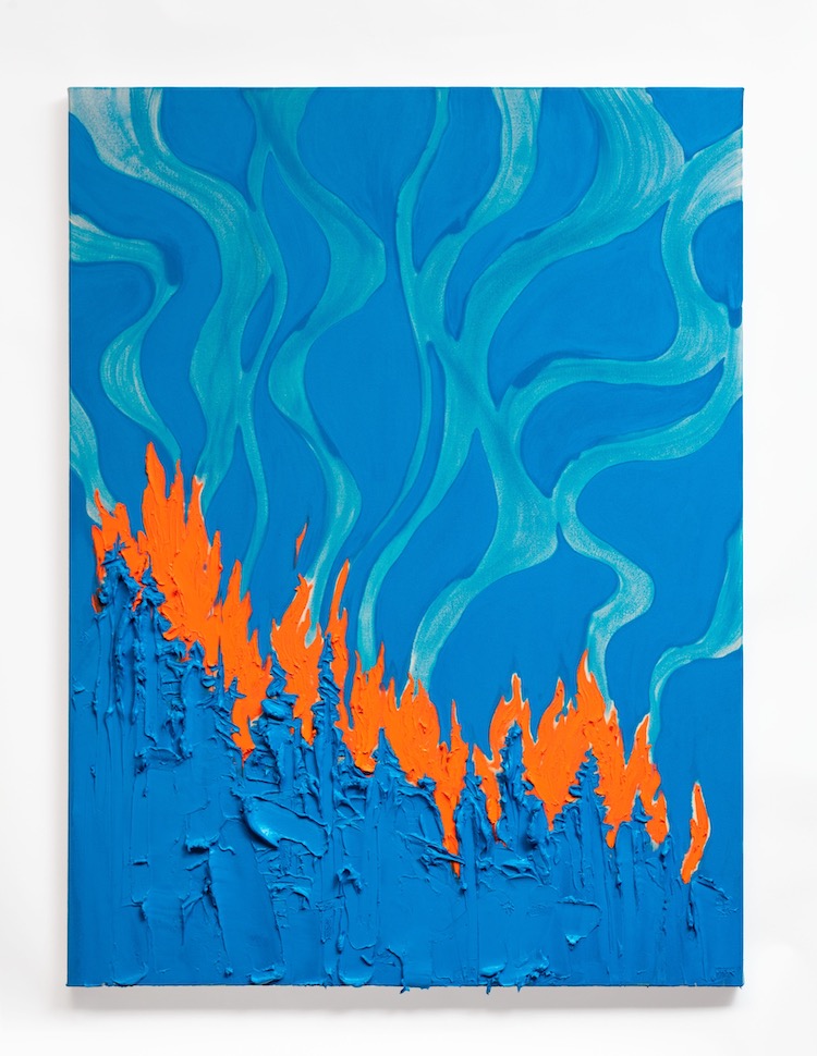
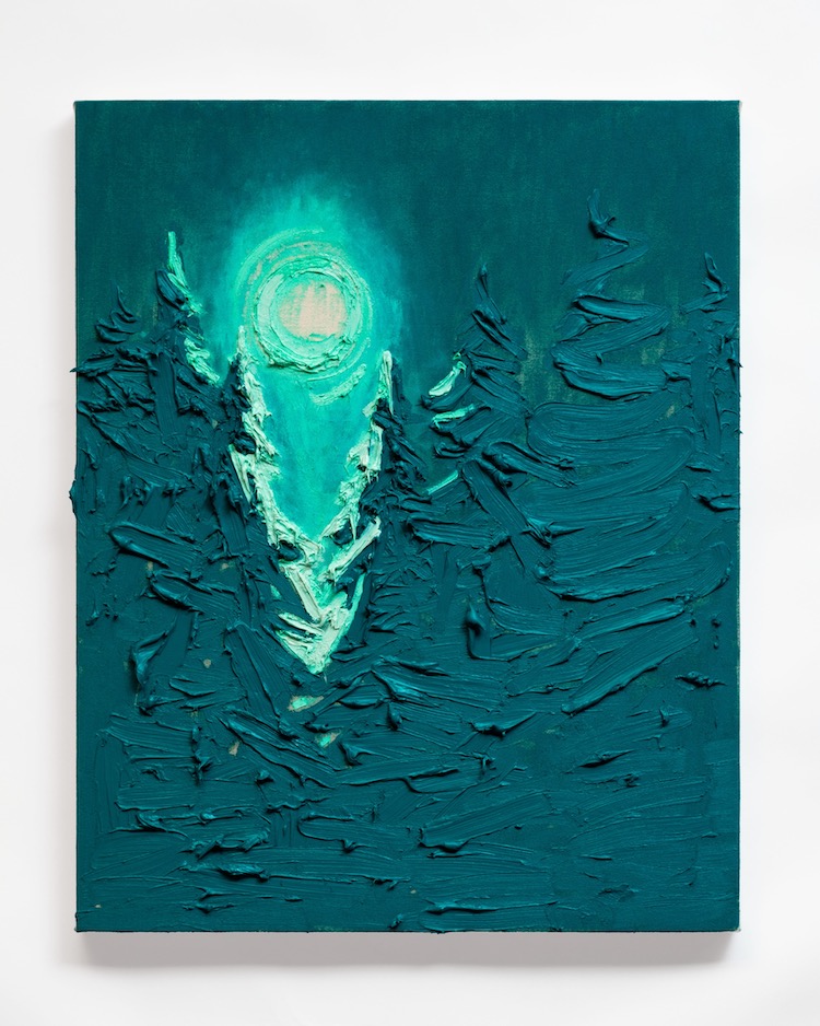
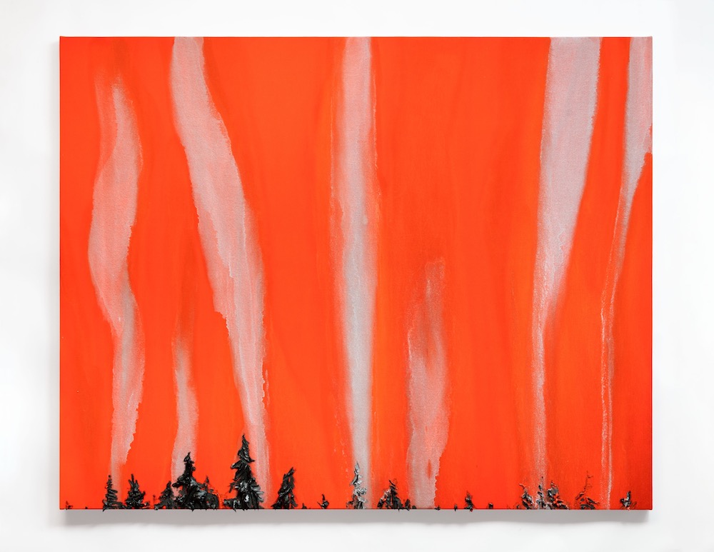
"I have always been really interested in color and now I finally had time to take a very nerdy deep dive, which is something that had always been bookmarked in the back of my mind. I got obsessed with how simplified color combinations or even monochromes could create visual ambiance, tension, mood, etc," the artist told us about where the idea for such an intense and extraordinary body of work came from. Cornered into his studio and his mind with the pandemic setting, Dorland started noticing the "micro-moments" and the way smaller and smaller fragment of a scene has the potential to embody a complex emotion or psychology. With more time to explore, he thought of an old concept in which intense colors in very limited combinations, would be the core of the work. "I chose the colors in the show because I wanted to create visual "friction" and/or ambiance through simple color relationships. In my mind, these very simple color combinations work to instantaneously activate the content. So, using the color to hold the viewer there to deliver the content, if that makes sense," he told us about the thought process behind such striking choices. The employment of such exceptional hues is meant to highlight the content beyond what the eye would discern but also intensify the emotion that we can identify with. Therefore, the orange in Blue and Orange, 2021, underlines the raging fire of a forest ablaze with a stylized, unnatural depiction, as the turquoise glow emphasizes the blinding brightness of the moonlight in the dark woods in Glow, 2021.
Through his past work, Dorland has proved his interest in reducing the imagery he was working with while conveying, if not heightening its atmosphere. The reduction of water surface to lines, the trees into silhouettes, and the celestial bodies into circular elements was all part of those efforts. But in this body of work, he approached painting from an even more minimal standpoint, sculpting rather than illustrating the smaller, less significant elements. "I'm always trying to move away from documented images. The landscape for me is rarely about illustration. It's a stand-in for psychology, emotion, identity. The act of simplifying the color taught me a lot about the reduction and simplicity of imagery," he told us how this body of work continues onto his past practice. But besides the captivating visual effect of such ferocious colors, there is a strong conceptual aspect of this new approach. "In my thinking, it relates to the shift in thinking about climate change. Before it was something to worry about, now, it's just a given. It's just there in our images of the landscape. I don't mean this politically, but it's just a fact, and as a landscape painter, I wanted to try to emulate that," Dorland revealed, turning the striking, plastic appearance of the untouched wilderness into alarming warning signs we can't and shouldn't unsee. —Sasha Bogojev