Todd Schorr's ever-expanding menagerie of eye-popping creations and his meticulous technique make him a true, original master of the lowbrow art movement
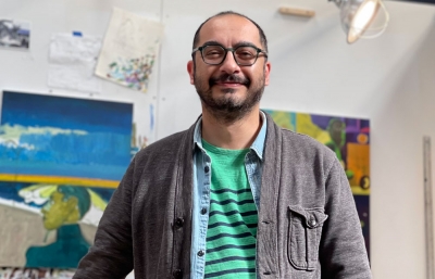
There is perhaps no artist who can create a mind-blowing, expansive landscape filled with a myriad of comical characters better than Todd Schorr. His ever-expanding menagerie of eye-popping creations and his meticulous technique make him a true, original master of the lowbrow art movement. He recently completed a new masterpiece titled Liquid Universe, commissioned by Nike executive Sandy Bodecker. I got the inside scoop on Schorr’s unique process behind this seven-by-nine-foot painting, along with a detailed diagram of his densely-packed composition.

Gregg Gibbs: The theme of the painting is childhood imagination. What was the genesis of this idea for executing a major work, and how did you approach the theme?
Todd Schorr: Initially, Sandy approached me with his idea for a painting that would use childhood wonder as its theme. He wanted the painting to serve as a point of inspiration for the design studio/think tank he was developing in Portland. He feels that experimentation and imagination, when nurtured and encouraged as a young child, will help to set a course for further evolution as an adult. How to develop this idea into a painting was left up to me. I began by giving Sandy a written description of the scenario that I envisioned, the Liquid Universe idea. I wanted to incorporate various images into the painting from subjects like history, art, literature, science, music, and humor that I felt were important to a developing imagination.
I understand that you started with concept drawings, through the layout designs, moving onto a color study, and finally, completion of the finished painting. Can you explain the process and how long it took to complete?
Once I had my idea, it took about two months to work up the finished pencil drawing. For me, the drawing stage is always the most crucial step in the process of creating a painting, especially with a painting that involves many separate elements. To create a pleasing and dynamic composition tying all these bits and pieces together is always a challenge. I also strive for a certain amount of rhythmic flow running through my compositions. Once I have the finished drawing completely, I do a small color study so I can see how my idea for a color scheme will work. I do color studies only for large canvases where corrections can waste a lot of time. With a color study, I’m at least in the ballpark of where I’m trying to go. From there, it’s on to the final painting. I start with a monochromatic underpainting of raw umber and then gradually build up my color layers—thin for shadows, thickest paint for highlights—the same methods as used by the old masters that have been handed down to painters over the centuries. The entire work from concept to finished painting took about a year.

How did you decide to feature elements from Sandy’s biography as a boy and to include members of his family? What were some of the personal specifics Sandy wanted to incorporate?
Among Sandy’s many accomplishments over the years at Nike, he was responsible for the company’s success in action sports, which includes skateboarding. Since this was a painting centered around childhood, I asked Sandy for photos of himself from when he was around 10 to 12 years old. Thus, I have Sandy posed with a skateboard. I asked for similar photos of his girlfriend who stands next to him atop a winged brain. Sandy also wanted his niece and nephew included in the painting, whom I depicted as the two little pixies floating along in the middle-right portion of the composition. His nephew George is a musician, so I have him holding a guitar, and Astrid, his niece, is an artist, so she holds a palette and brushes. Sandy’s father was an illustrator who had a great handlebar mustache. When I was considering various historical references, I thought it would be fun to have his father serve as the model for the burly Viking warrior who’s shattering the chain of the tethered brain.
Tell me about the concept of the Liquid Universe landscape and the meaning of the cosmic ocean dream world. Were you trying to convey the idea that imagination is rooted in a surrealistic consciousness?
Sandy has a fondness for the comic book character Silver Surfer, who’s basically known to surf the universe. Building on this theme, I developed this concept where the universe is like a cosmic ocean. That is, an entity that is in a constant state of flux or ebb and flow like the waves of the ocean. I also wanted the atmosphere to have a psychedelic feel, so I graphically translated this notion into a sky that appears to be the liquid pulsations similar to those found in a lava lamp. This concept also ties in with the idea that experimentation and imagination are characteristics that are in constant states of flux as well.
Can you fill me in on the mid-twentieth-century cultural references that correspond to your childhood years and figure prominently in your body of work?
I’m interested in so many subjects from many periods of time, but yes, mid-century cultural references are prominent in many of my paintings. These references, picked up in early childhood, have had a strong and enduring hold on my imagination, probably because, as with all children, the strongest impressions are implanted in your developing brain by the age of nine. So this Mulligan’s stew of Saturday morning cartoons, cowboy and puppet shows, vintage monster and fantasy movies, comic books, styrene plastic models, as well as an obsession with prehistoric cave men courtesy of old National Geographic magazines, formed the core of my developing aesthetic sense. All this absorbed while living under the Cold War threat of nuclear devastation.

Recently, you and your wife, artist Kathy Staico Schorr, became bi-coastal homeowners with a new studio in Connecticut. How does being in a bigger studio setting affect the way you work?
It’s a world of difference having a new studio space with 20-foot ceilings. It’s just a better work environment all around. I’m currently working on two huge canvases and have also invested in some really great metal scaffolding that can be easily adjusted so that I can work at any height. You know, the problem when working on large canvases is not so much getting to the top of the painting, but being able to work comfortably at the bottom of the canvas. When I was working on a large painting, I had to sit cross-legged on the floor while working at the bottom because, at over eight feet in height, the canvas was rubbing the ceiling when it was only a foot off the ground. Not very comfortable when you’re trying to do very detailed work. I know you can work on un-stretched canvas laid against a wall and rolled to size, but I’ve always preferred working on tightly stretched canvas that has that nice little soft give as the brush caresses the surface. The plan now is to work on large canvases in Connecticut and smaller works while in LA.
How did it feel when you made that last mark on the canvas and laid down your brush, having completed this massive painting?
That’s always such a satisfying moment after months of chipping away to completion... always a cause for celebration.
----
Originally published in the January 2017 issue of Juxtapoz Magazine, on newsstands woldwide and in our web store.